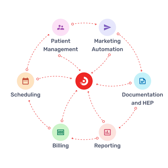
Prompt’s all-in-one EMR, Practice Management, Scheduling, Billing, and HEP software.
Scale experiences, increase efficiencies, and deliver better care with a single, holistic view of every patient, member, provider, and partner.
Lower costs and automate health team workflows with AI
Hyper-personalize health experiences throughout care journeys with data
Deliver individualized care and service in real time, from anywhere
Automatically refill or fill empty appointment slots
Plan of Care Compliance Automation
Provide the flexibility to require “Visit Approval” before a visit is officially scheduled. Patients will receive a confirmation when visits have been approved or denied.
Fill spots by considering the provider’s capacity, plan of care, eligibility, and other relevant factors using. AI feature.
Two-Factor Authentication
Update comps with the newly designed design system.
Adopt design guidelines for a visually coherent interface.
Optimize menus, navigation, feature discoverability, and clear call-to-actions.
Integrate the new AI feature.
Ensure a seamless experience for both iOS and Android users.
Design a visually appealing interface that is engaging without causing cognitive overload.
Canceled Visits and Open Appointments
Therapists’ schedules often have canceled visits or open appointments, leading to inefficiencies and underutilization of resources. A solution is needed to better manage and fill these gaps.
POC Compliance Automation
Ensuring compliance with Plans of Care (POC) is manual and error-prone. Automation of POC compliance is required using AI to reduce administrative burden and enhance accuracy.
Front Office Workflow Improvement
Front office workflows lack flexibility and efficiency, particularly in visit approvals. System should streamline processes, enabling visit approval before scheduling and sending confirmations to patients.
Two-Factor Authentication Without Account Creation
Enhanced Scheduling Platform
The current scheduling platform does not adequately consider provider capacity, POC, and patient eligibility. A more sophisticated system is needed to display available slots and improve scheduling accuracy.
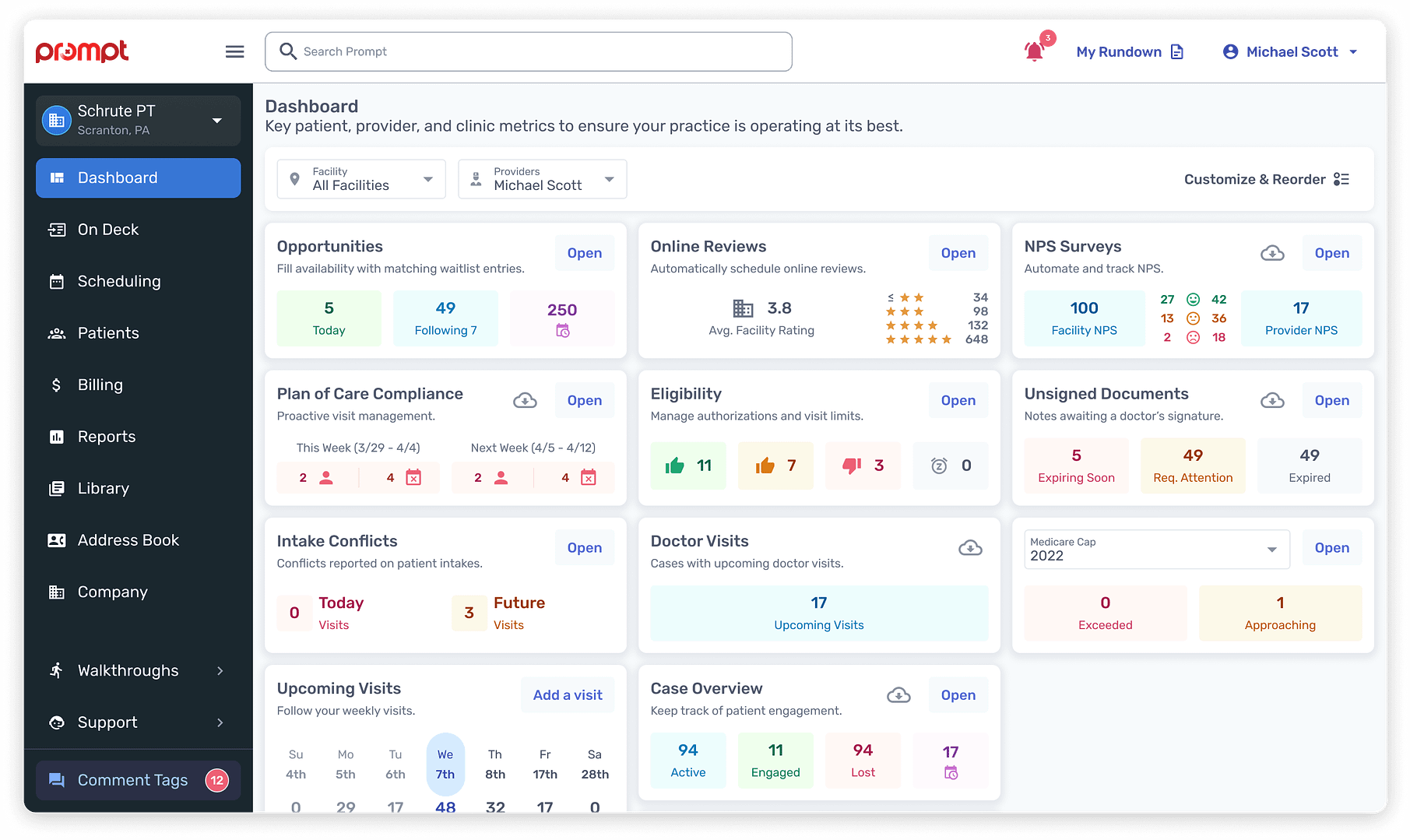
Dashboard Information Gaps
Dashboard enhancements are needed considering AI with actionable insights.
Non-Compliance with WCAG 2.2 AA Standards
Inconsistent Branding
Inconsistent use of brand colors, layouts, and visuals across the CRM platform undermines brand identity. Standardization is required for a cohesive visual experience.
Startup Clinic
Single Location
Multi Clinic
Enterprise
Front Desk
Therapist | PT, OT, SLP
Biller
Owner
Build component library using the new design system.
Ensure compliance with WCAG 2.2 AA standards.
Regularly collaborate with the accessibility (a11y) team.
Work closely with developers to break down the process and gather feedback.
Integrate motion design.
3 months
WIP
Review
Development
Shipped ✅
Archive
Product features
Waitlist Opportunities
Plan of Care Compliance Automation
Online Scheduling
Online Surveys & Reviews
Eligibility & Authorization
Digital Intakes
Unsigned Documents
Notificaitons
My design process
Once I have the workflows through discovery, research, and testing, I generally start “designing” what a proof of concept or final product will actually look and feel like. Color, typography, shapes, and motion are all part of my toolbox, but they mean nothing without the infrastructure of understanding.
Auditing products
Component research
API decision
Creating proof of concept
Internal discussion
Advocates review session
Creating the base variant
Creating the variants in different themes
Documentation
Motion design
Dev review
Design review
Time to go live
UX process
Every organization is a little different. I worked on well-established products at a large company that require many stakeholders to be involved in the strategy and rollout of a feature or product. I worked at agencies where we built something from nothing and there were far less people involved.
I work with product, engineering, and beta testers to make critical decisions about operational workflows in a physical therapy center.
We had a hypothesis that efficiencies and speed could be built in the way current EMR software operates.
Next, we took a holistic look at the sticker sheet of design patterns and those patterns eventually started to become a “design system. The purpose of this was to have reusable parts that support the brand visually, the users’ experience, product’s function, and designers’/engineers’ efficiency.
Implement
At Prompt, UX writes most of the tickets (documented visual, logic, and functionality that engineering builds into the product). Our product teams work in an AGILE environment.
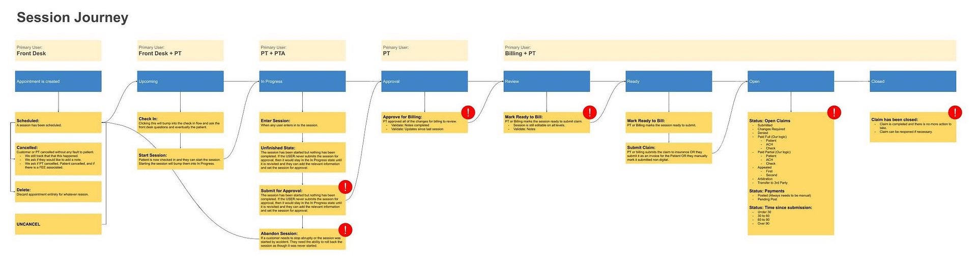
Mapped out the states a patient’s visit can exist in from start to end to work with engineering on the business logic associated with each state.
API Design
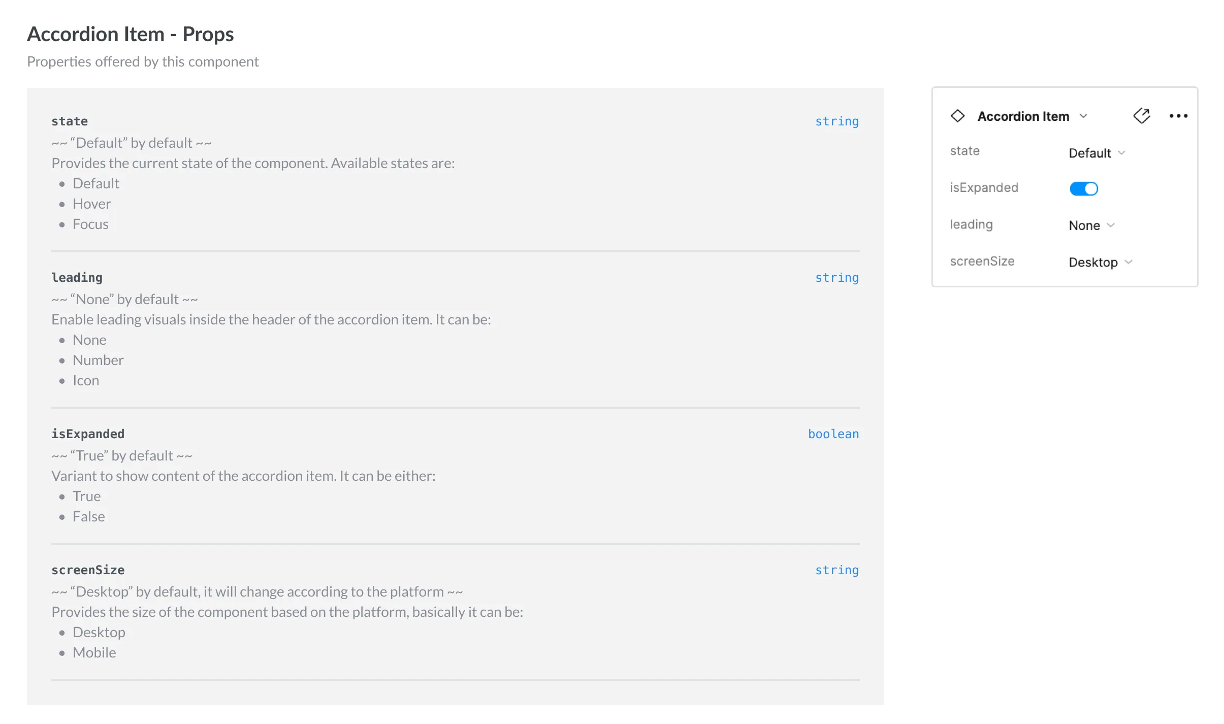
One of the x-factors while creating PoC was to reduce discrepancies between design & dev by exposing a set of synchronous APIs on both, so a API on Figma translates exactly into a React prop for a developer to consume thereby reducing any possibility of friction.
This process starts with creating an extensive list the all the variants and props that can be given to users. Post these there are internal discussions with developers and designers to decide which props should be exposed and which should not be exposed.
Proof of Concept
Based on the insights gained from the audit and research, a proof of concept of the component is created. At this stage, the focus is less on the visuals (how the component looks) and more on the functioning (how the component is structured)
Engineering Discussion
This discussion gives the developers a brief overview of how the component is structured and what props are available for the component. On the design side, it helps to understand the tech feasibility or considerations that need to be taken into account, edge cases of the component that might have been missed, and receive quick feedback on the designs.
Creating Component
Once the component structure and API decisions are locked, the base component is created.
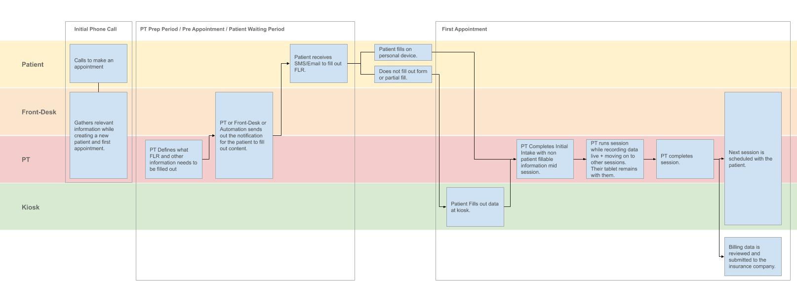
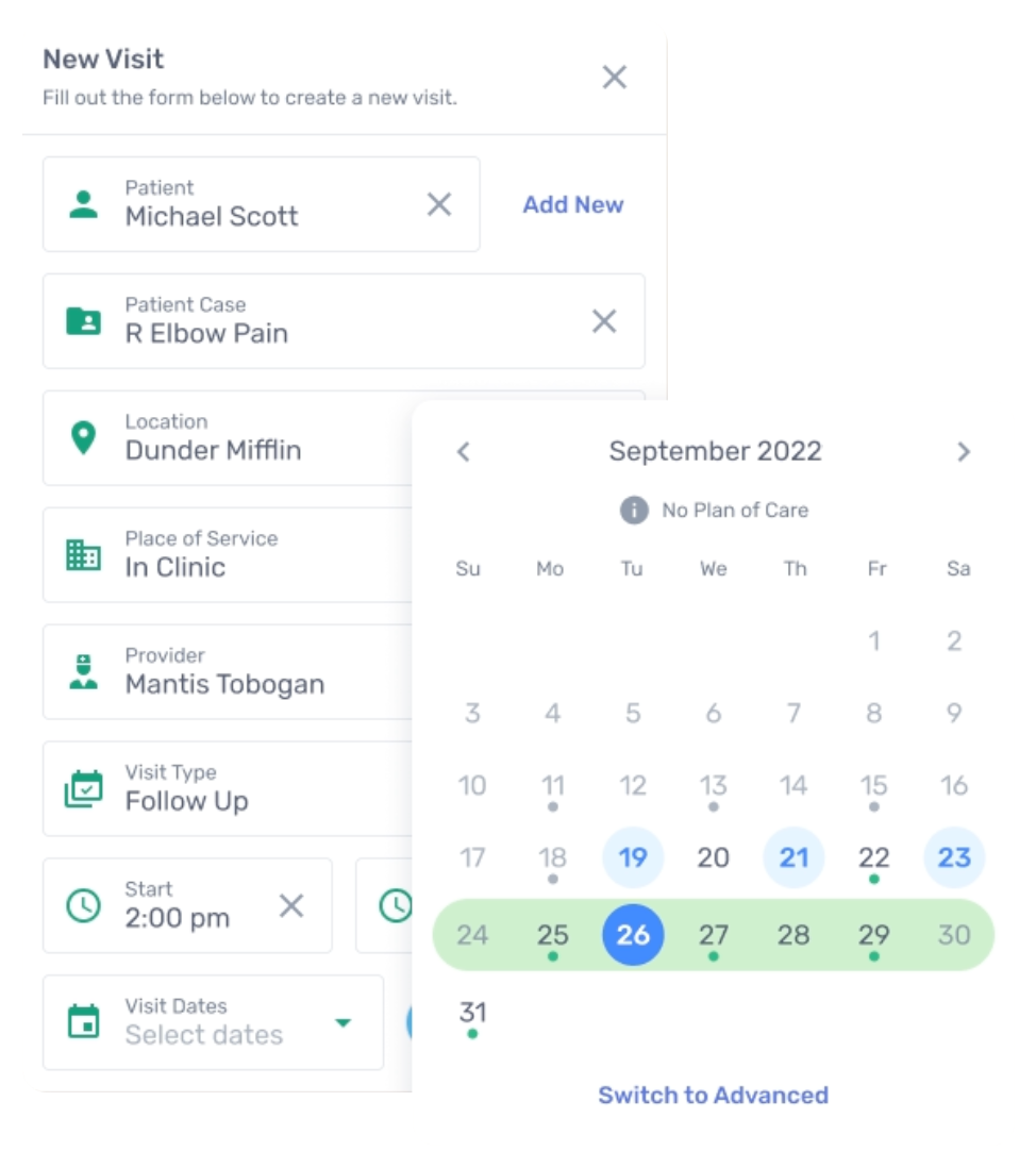
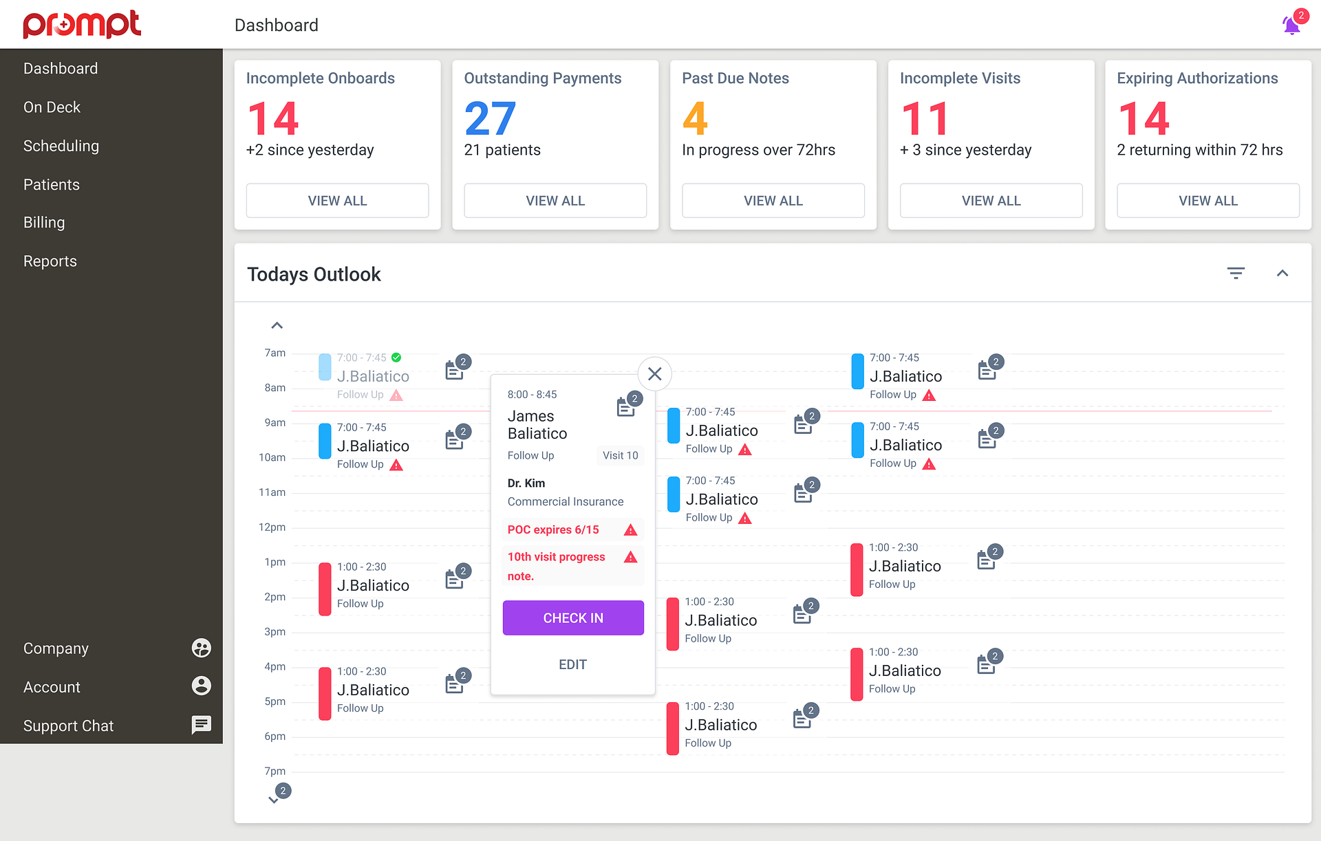
Smart Scheduling
Prompt’s scheduling solution provides visibility for entire practice’s case load.
Shows available spots in calendar.
It is fully integrated into Prompt so it considers provider capacity, Plan of Care, eligibility.
Patients get the best visual feedback to know what visits make sense
Patient Care Coordinators get to focus on other value-adding tasks.
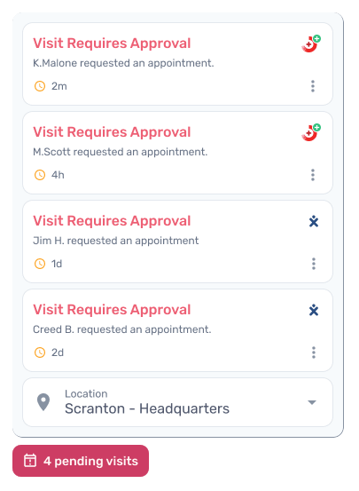
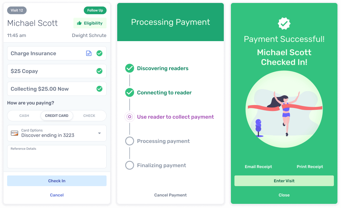
Approval Process
Option to require “Visit Approval” before a visit officially makes it to schedule.
Patients will receive a confirmation when their visits have been approved or denied.
The whole workflow is streamlined to improve front office efficiencies while still giving patients the flexibility to book when they want to.
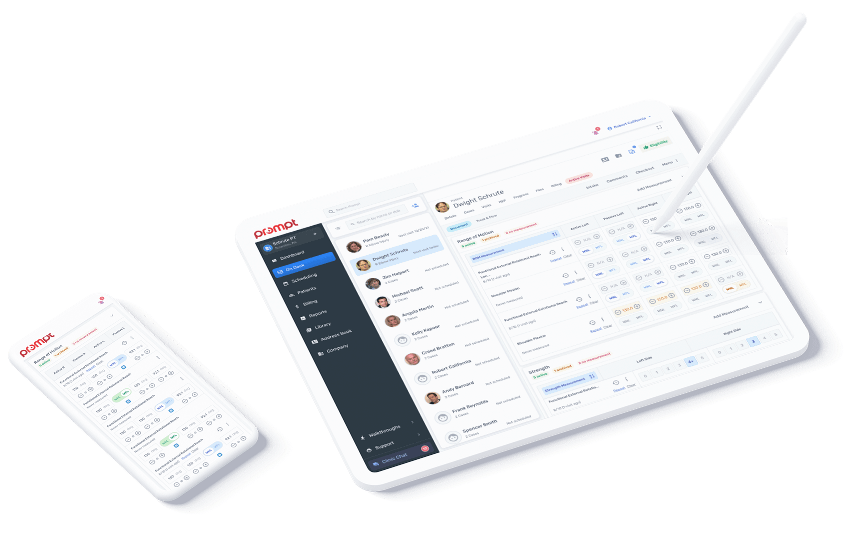
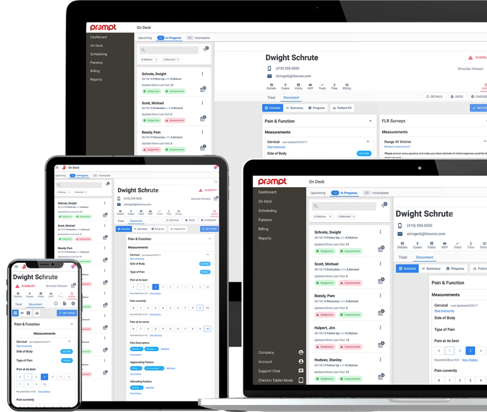
Therapists | PT, OT, SLP
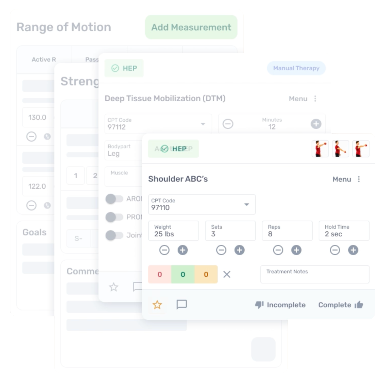
Documenting on the move
Prompt’s innovative documentation and treatment framework allows providers to document efficiently on any device, anywhere.
This component make up robust documentation library works across all breakpoint.
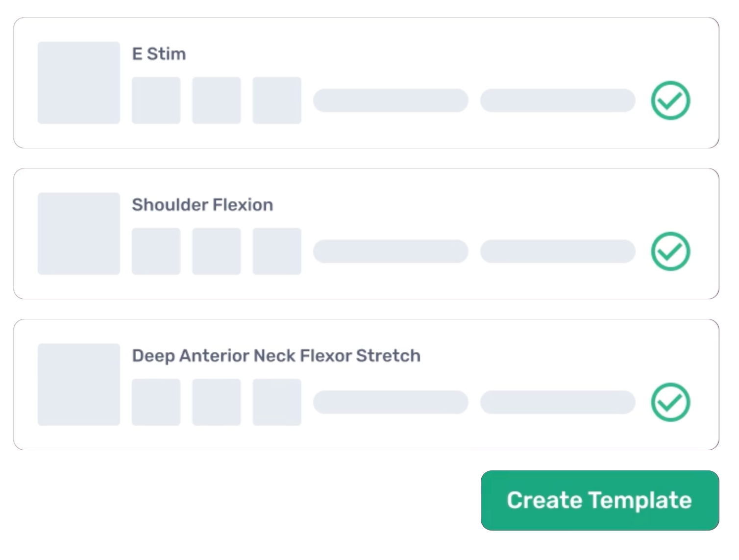
Organize items into easy-to-apply templates for common injuries.
This also allows larger clinics to standardize treatments depending on injury and severity.
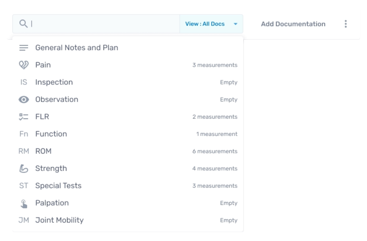
Search option has been added to improve documentation speed and accuracy.
find what you need or add new items with minimal scrolling or typing.
Capture Details
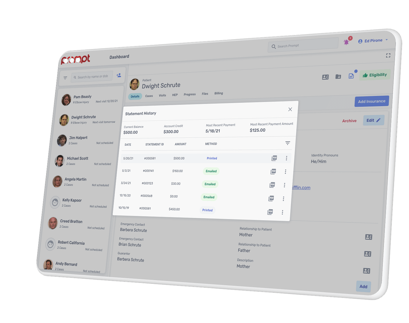
Front desk collections
Enter copay, coinsurance, and any relevant notes to setup and capture payment for current and upcoming visits.
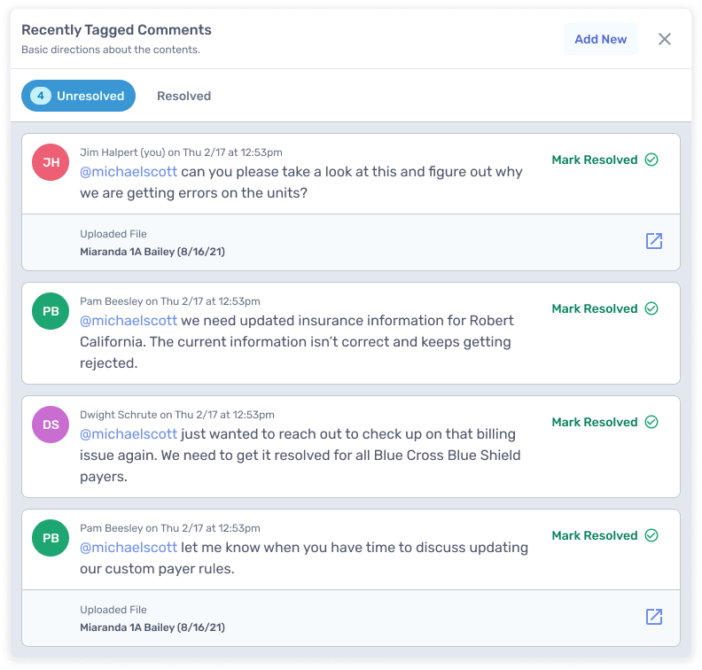
Empower teams
Securely communicate with team
Comment in multiple areas of the component, tag colleagues, and resolve tasks.
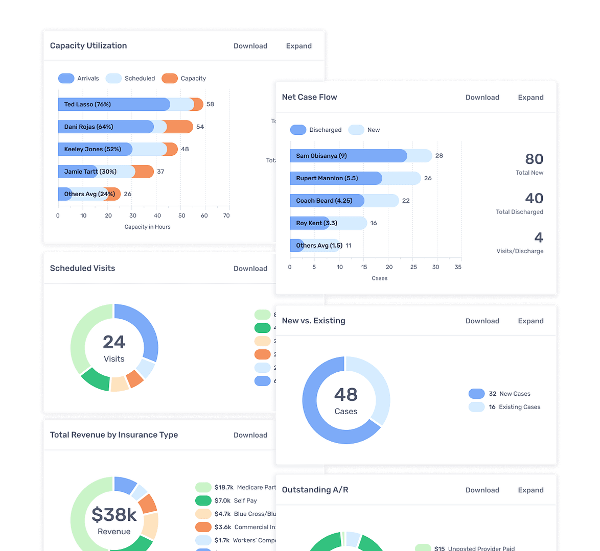
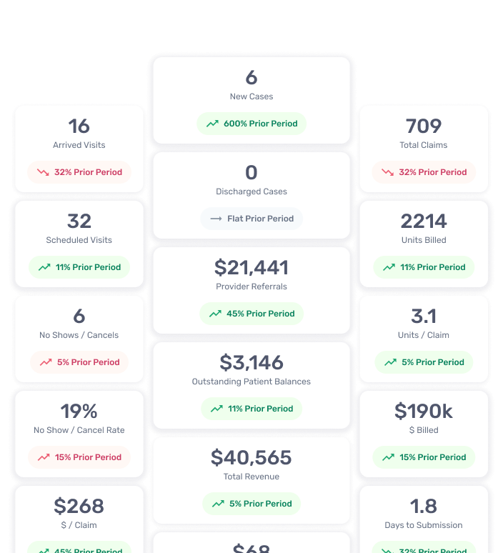
Data driven decisions
Get specific and take action
This is owner facing component for located in dashboard thats ultra specific on metrics tracking things like provider capacity, revenue, units per claim, insurances that pay the most, and referring providers.
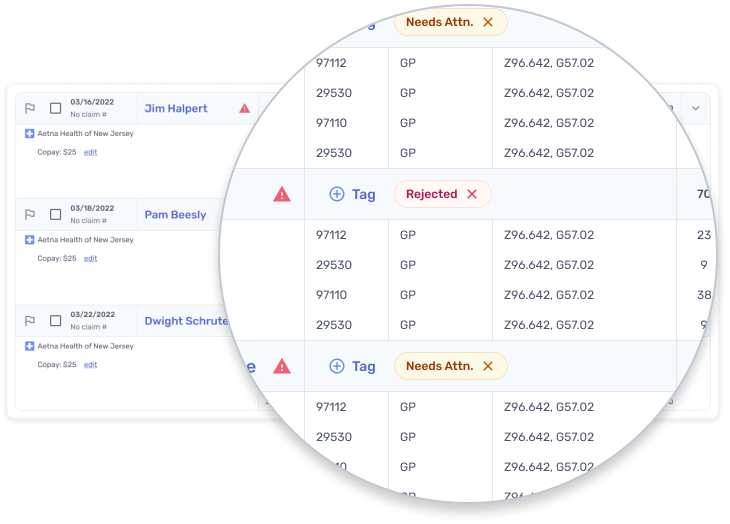
Auto Posting
Track authorization
Post all clean claims
Submit claims to the secondary insurance when appropriate
Transfer all PR to the patient when appropriate
Follow the structure of Financial Hardship Agreements you created with your patients to ensure nobody gets accidentally billed in the event you have a custom agreement.
Beta tester
Final product
User testing
For usability testing I made a clickable prototype. This allowed users to navigate through tasks.
We receive feedback in early phases of design but images/wireframes or even clickable prototypes are rarely exactly the same experience as a user will have in the actual product under real-life work conditions.
UXR analytics shows
Time a user stays on a certain screen,
Amount of times a user visits a section,
Average time it takes a user to perform a task in the product,
The important part is deciding what these metrics should be so we constantly drive towards a better experience for our users.
The insights gained from this research helps to understand:
Best practices for the component
Usage guidelines, accessibility, interaction, and behaviour of the component
How others systems have structured their component
What are the possible variants that the component can have
What all props can be offered for the component
Documentation
The next step is documentation. All the components are intensively documented. The component documentation consists of the following:
Introduction — gives a brief definition and overview of the component.
Dev Characteristics — contains all the information that developers would need while building the component. It includes the component props details and the tokens used to design the component.
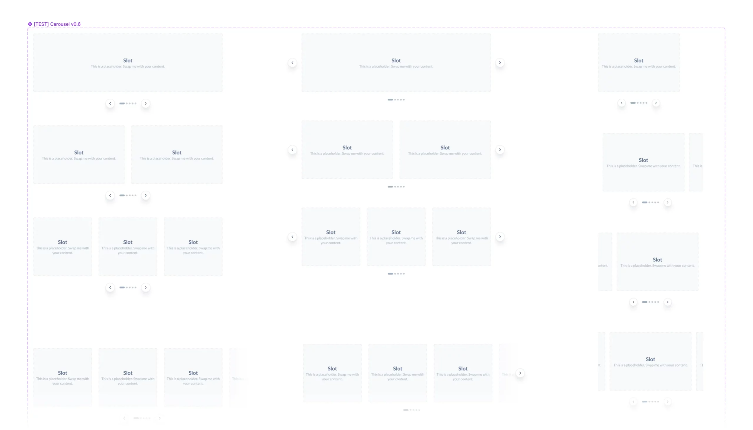
Variants — shows all possible variants of the component at an overview level.
Usage Guidelines — has information on what practices should be followed while using the component and tells how the component should or should not be used in different use cases.
Platform — contains information on how the component should be used across different platforms.
Accessibility Guidelines — has information about accessibility practices that everyone should take care of while using the component.
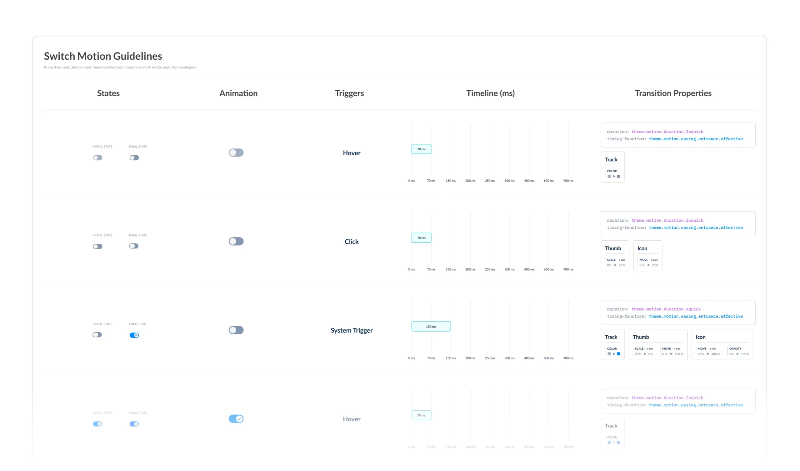
Motion Guidelines — has all the details regarding the animation of the particular component.