Our scheduling lived inside Healthie, a third-party platform. That meant we were bound to their design system, colors, fonts, and flows — none of which matched our own. On top of that, reliability was a gamble: sometimes appointments would vanish, sometimes they wouldn’t load, and sometimes adding an appointment in the moment just wasn’t possible (whether the patient was calling or standing right in front of us).
Build a fully in-house calendar from the ground up, in our own design system, with our brand colors and fonts. Create something reliable, fast, and flexible enough for both individual and group appointments — without losing control to a third-party dependency.
Healthie’s scheduler was outside our control. Bugs were theirs to fix on their timeline, and they didn’t match our workflows. The experience was inconsistent, the UI felt foreign, and the disappearing-appointment issue alone made it impossible to trust.
Lead UX from concept to handoff — mapping requirements, defining flows, prototyping, and testing until we had something that worked for every use case without overcomplicating the interface.
Me | 1 PM | 5 Devs | 1 VP Product
12 months
WIP
Review
Development ✅
Shipped
Archive
Calendar & Scheduler — Built for ICANotes+
Replacing our 3rd-party “Healthie” integration, which suffered from disappearing appointments, missing records, and limited in-session scheduling, we built a fully native calendar from the ground up. This new scheduler lives inside our own design system with brand fonts, colors, and interaction patterns delivering visual consistency across the platform.
Designed for both speed and flexibility, the calendar supports one-time and recurring bookings, availability management, group sessions, automated reminders, telehealth launches, and direct note creation from any appointment. Providers can drag-and-drop to reschedule, filter by status or provider, and switch seamlessly between day, week, and month views. Availability can be fine-tuned per contact type, location, and appointment type, ensuring patients only see open slots relevant to them.
The result is a reliable, brand-aligned scheduling experience that eliminates prior frustrations while giving facilities the control, clarity, and confidence they need.
Features
Sync Google Calendar with ICANotes+ Calendar
Using In-app Messaging
Sending Text Appointment Reminders to Clients
Telehealth Session from an Appointment
Create a Note from an Appointment
Schedule an Appointment for Clients
Notifications
Filtering Options
Setting Availability on the Calendar
Calendar Settings
Navigating Day, Week, and Month Views
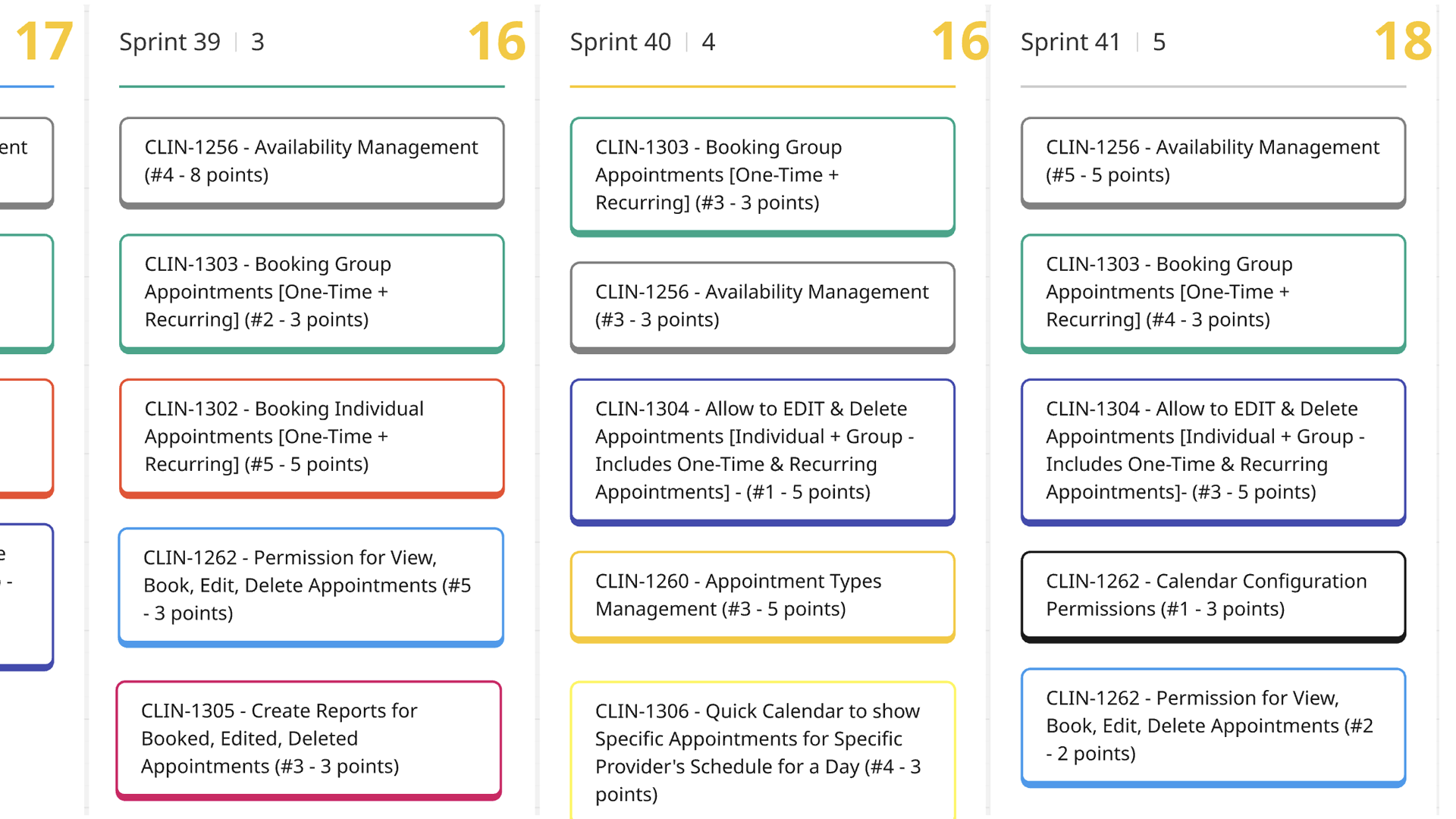
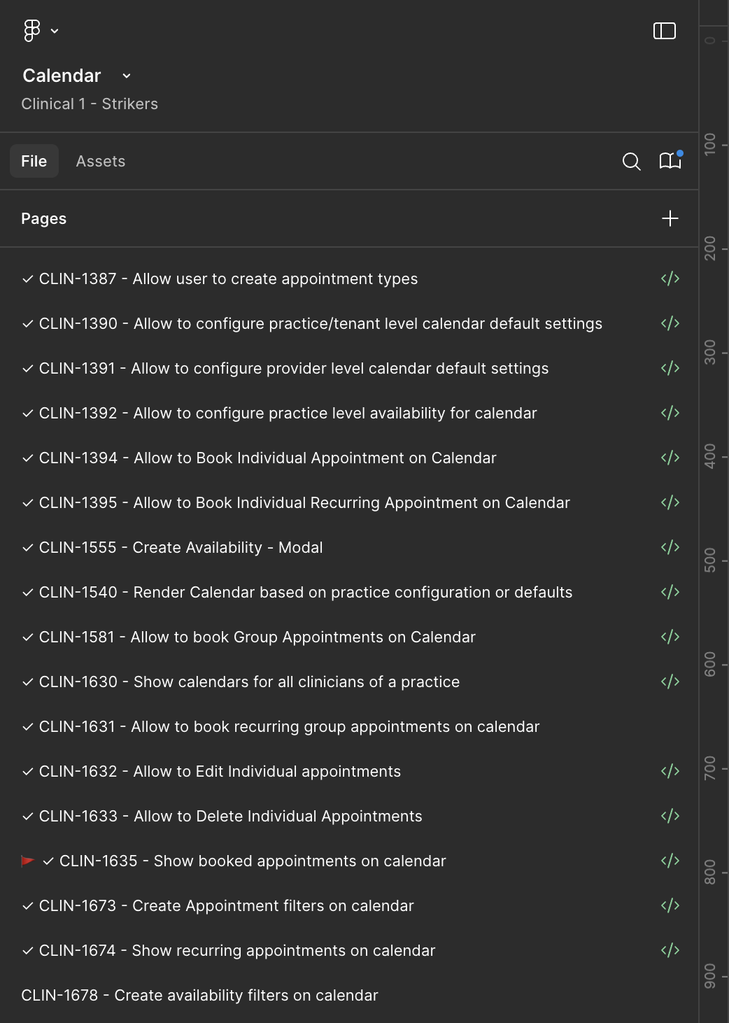
Stories lined up, ready for the two-week push
From Whiteboard to Final Pixel — The Calendar design Process
The project began with a deep dive into real-world use cases — gathering provider pain points, patient scheduling scenarios, and operational needs. Every note, edge case, and workflow was sorted and mapped out using a design thinking process to ensure nothing critical was missed.
From there, I built out the core design system components using an 8-point grid system, ensuring consistent spacing, typography alignment, and a clean, scalable look. This grid-first approach not only gave the calendar a polished feel but also made it easy to navigate and maneuver, even with complex scheduling views and filters.
From there, I built out the core design system components using an 8-point grid system, ensuring consistent spacing, typography alignment, and a clean, scalable look. This grid-first approach not only gave the calendar a polished feel but also made it easy to navigate and maneuver, even with complex scheduling views and filters.
The result is a calendar that’s both functionally robust and visually cohesive, seamlessly aligning with the ICANotes+ brand while solving the pain points that the old 3rd-party system could not.
Collaboration in Action — Shaping the Calendar Together
This video captures the behind-the-scenes collaboration between design, PMs, and developers as we worked through the calendar’s complex use cases. Rather than a polished walkthrough, it highlights the messy but necessary stories — trade-offs, technical dependencies, and design adjustments that surfaced during working sessions.
You’ll see how we tested ideas live, shifted components around, and balanced engineering feasibility with user experience goals. These conversations shaped the final product, ensuring the scheduler wasn’t just visually aligned with our design system but also technically resilient across browsers and workflows.
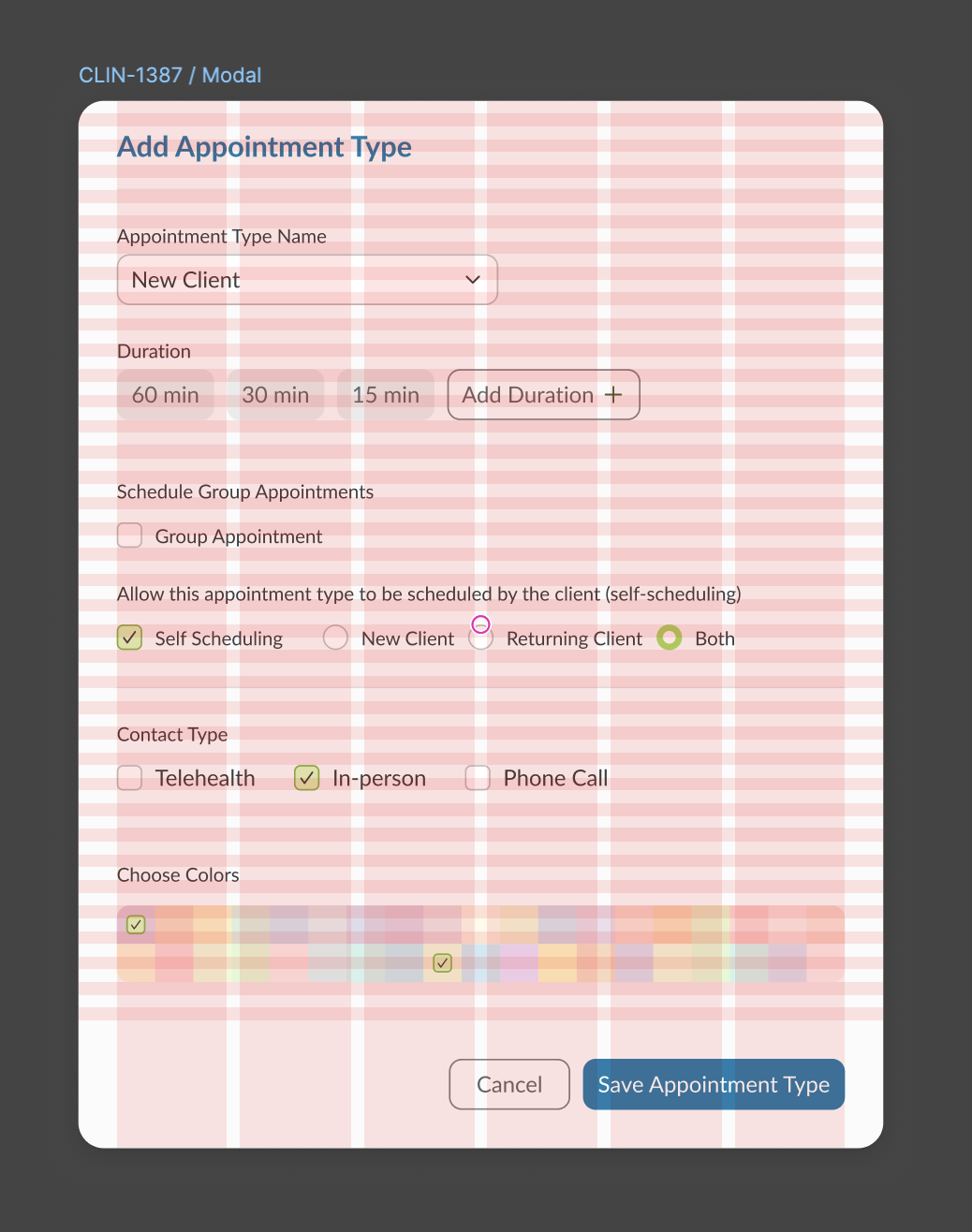
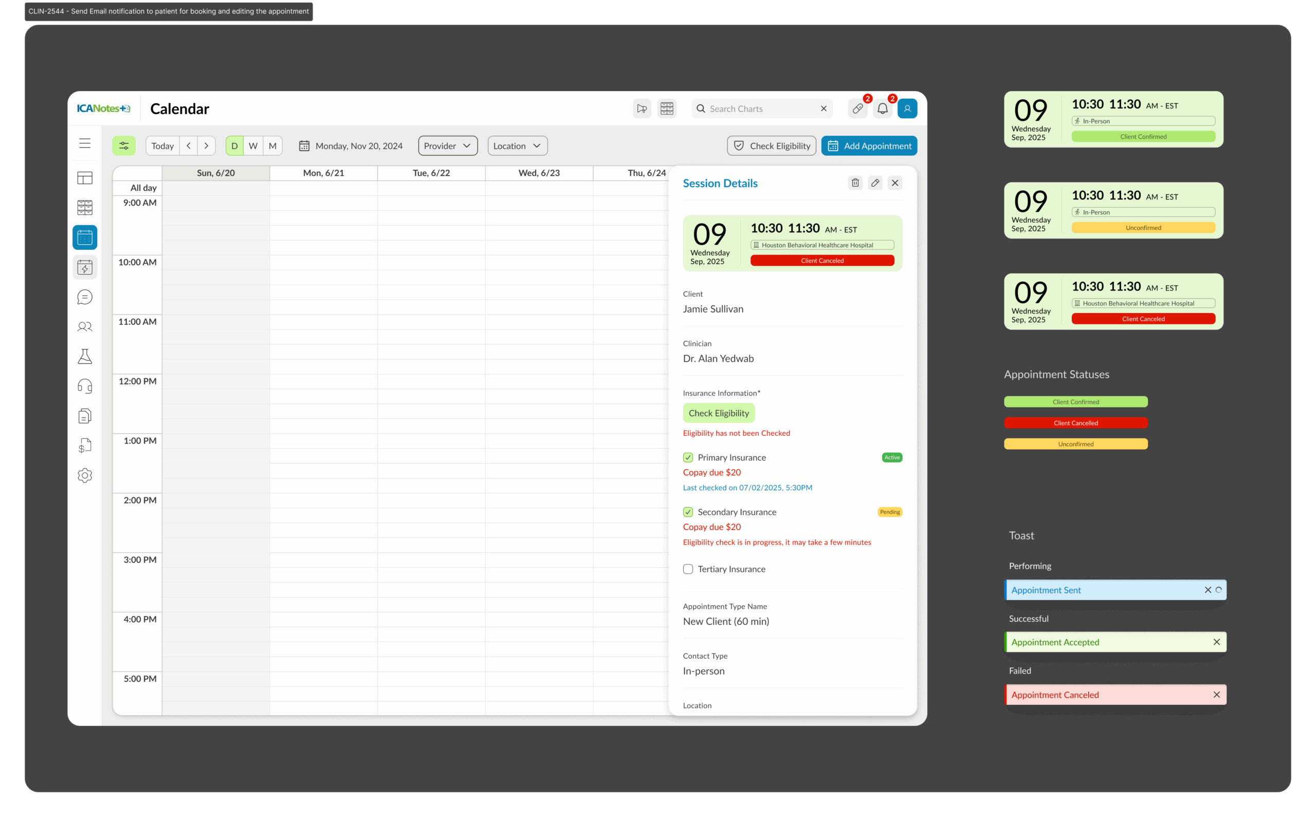
Creating an Appointment – Add appointments through the “+ Add Appointment” button. The new pane allows selection of patient, provider, location, room, type, and duration. Duration auto-fills based on appointment type but can be adjusted.
Recurring Appointments – Set recurring patterns (daily, weekly, monthly, or custom intervals) to accommodate ongoing treatments or follow-up sessions.
Editing Appointments – Appointments can be updated at any time by clicking into the appointment card. Providers can adjust time, participants, location, or type without re-creating the session.
Cancellation & Rescheduling – A simple edit or delete option is available on each card. Cancellations automatically update attendance status and send notifications.
Forms & Consents – Consent forms, intake forms, and evaluation documents can be attached directly to an appointment. These sync into the patient’s chart for quick access.
Automated Reminders – Patients and providers receive reminders (via SMS or email) based on customizable timelines, reducing no-shows.
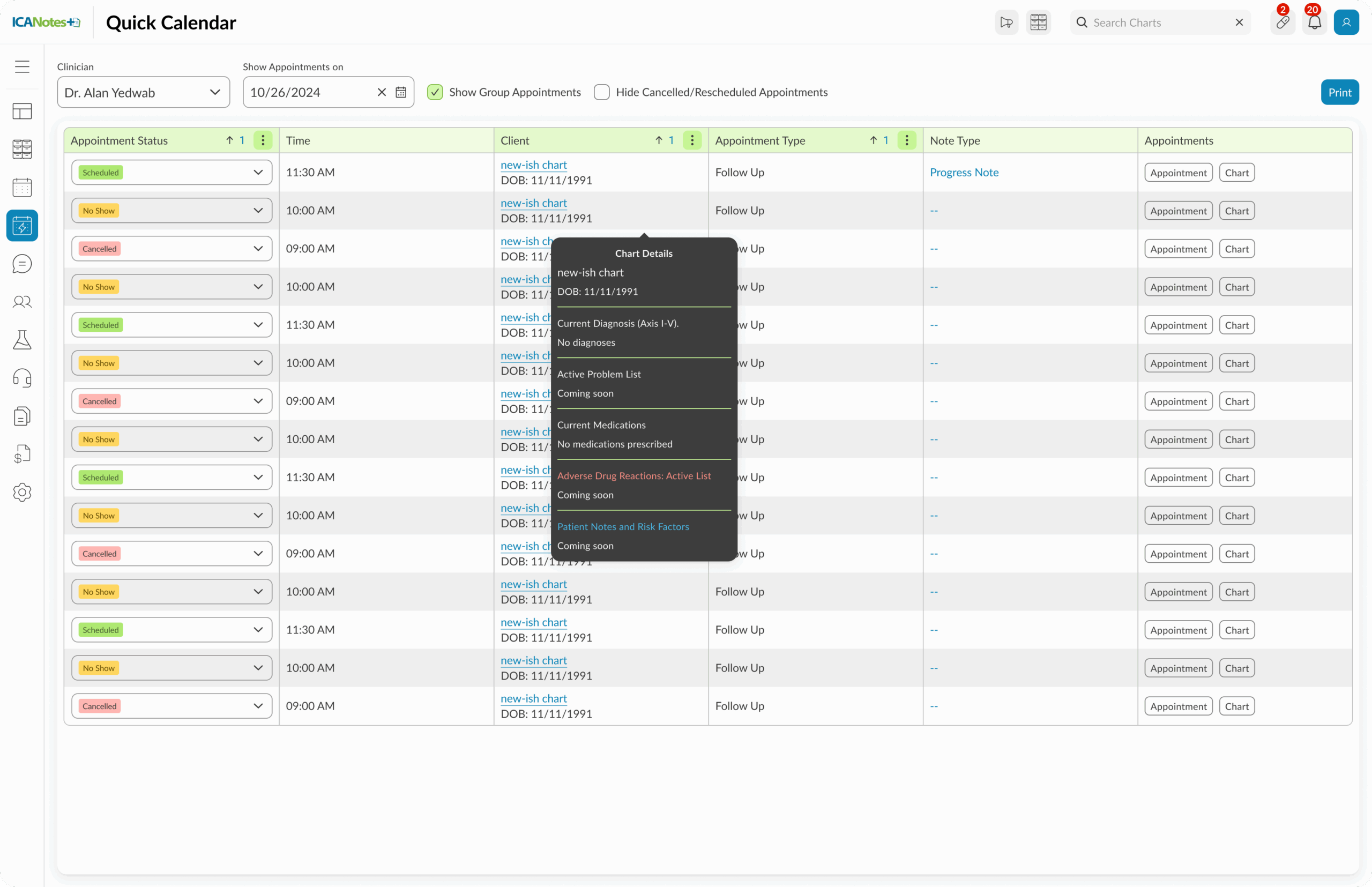
Attendance Tracking – Status (Scheduled, In-progress, Completed, Canceled, No-show) is easily visible and filterable.
Group Sessions – Beyond 1:1, multiple patients can be assigned to a session. Group appointment details remain accessible from the calendar.
Telehealth Integration – If the appointment type is telehealth, providers can launch a session directly from the calendar card.
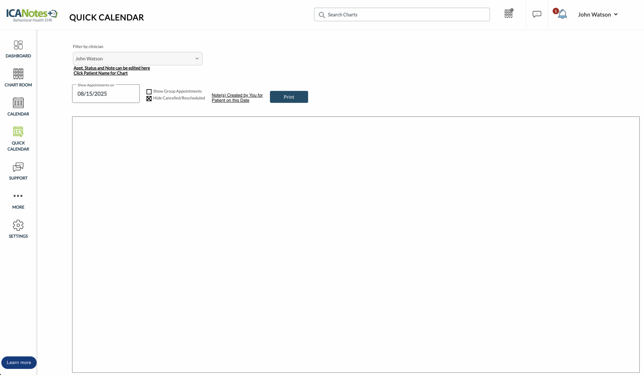
Quick Calendar View
A lightweight version of the scheduler for fast scheduling and quick checks. It opens as a compact overlay, showing today’s and upcoming appointments at a glance. Users can add or edit appointments in a couple of clicks, apply simple filters, and instantly sync changes with the main calendar.
Before
After
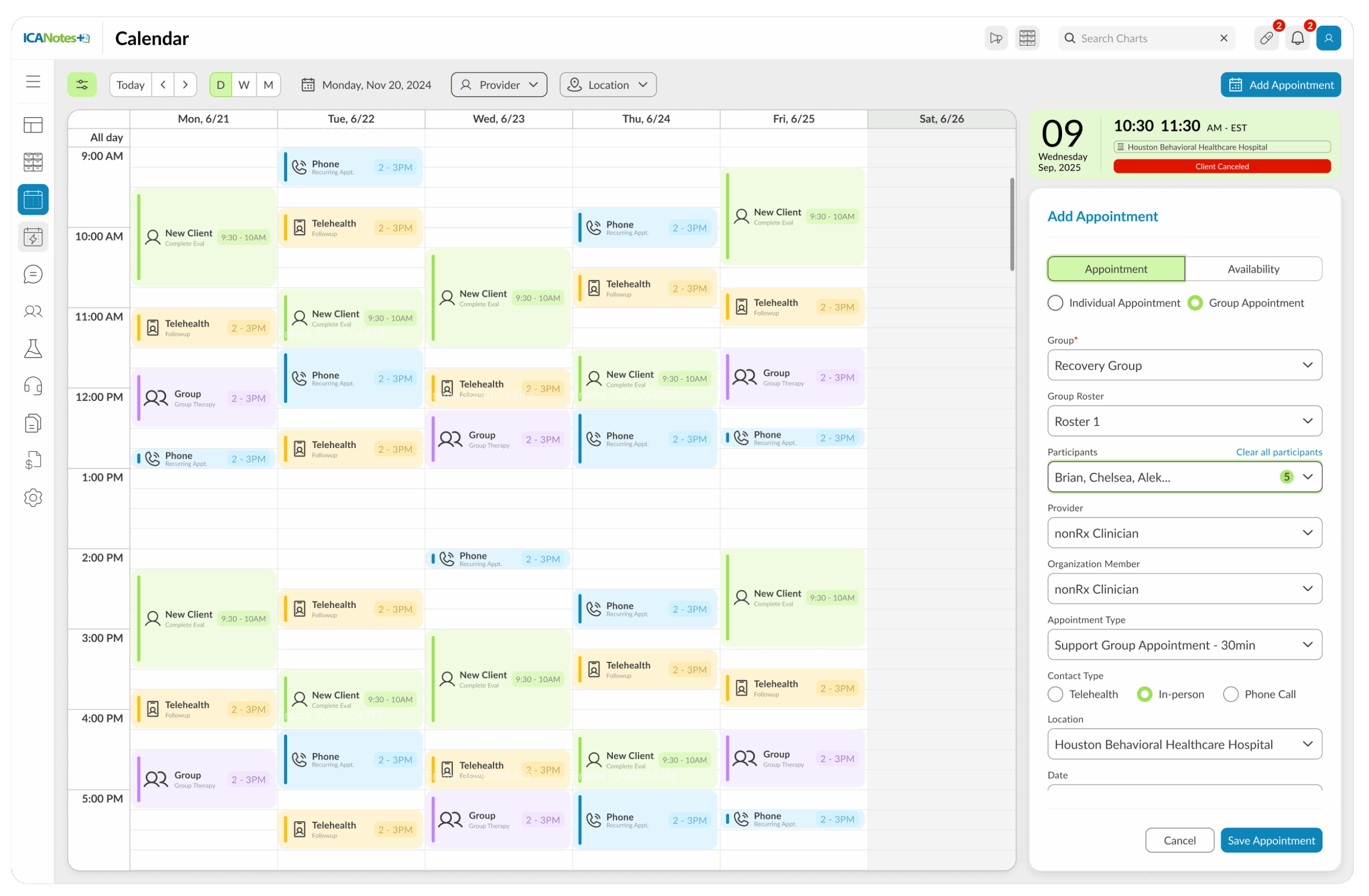
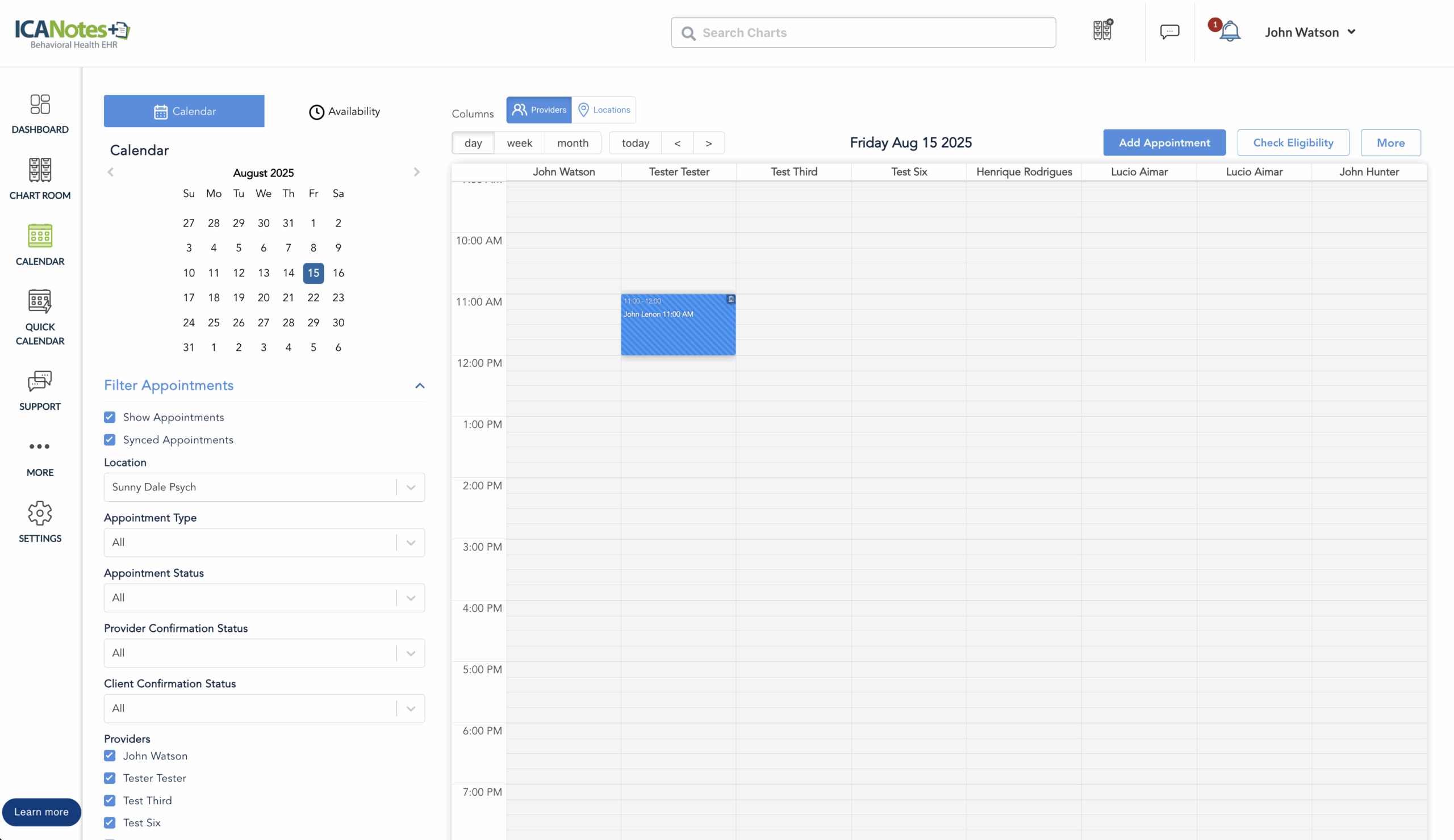
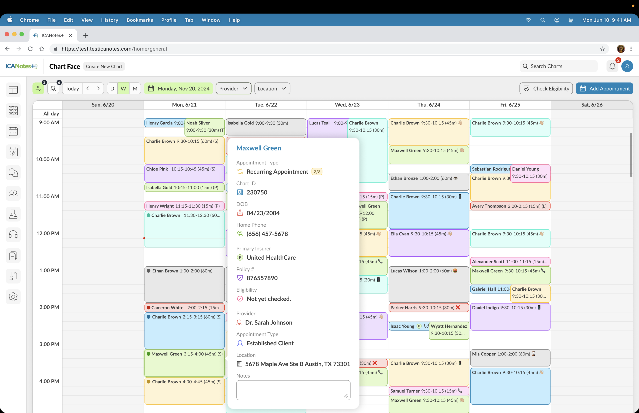
Calendar View
The full calendar is the central hub for scheduling. From here, providers and staff can view all appointments, group sessions, and availability in day, week, or month view. Filters on the left allow you to sort by provider, location, room, patient, or appointment type.
Appointments can be created with the Add Appointment button, where duration auto-fills based on type, and forms (consent, evaluations) can be sent directly to the patient. Clicking any appointment opens its detail card with actions to edit, reschedule, or delete. Group sessions can also be managed here, with quick assignment of patients to upcoming sessions.
The calendar ensures that everything from automated reminders to telehealth launches is accessible in one place, fully integrated with the patient chart for a consistent workflow.