AI Scribe turns doctor–patient conversations into ready-to-use clinical notes — without the clicking marathon. It listens, transcribes in real time, and builds the note in the background so the doctor can stay with the patient. Even if the internet flakes out, it keeps recording locally.
Use AI to take over the heavy lifting of note creation.
Make clinical documentation faster, cleaner, and less stressful.
Keep the doctor focused on the patient, not the software.
Building a note during a live session meant juggling the conversation while clicking through Shrub buttons and fields. It was slow, easy to mess up, and demanded too much of the clinician’s attention at the worst possible time.
Lead UX from start to finish — I designed three complete versions, tested the flows, and drove us to the final build. Every decision kept the focus where it belonged: on the patient, not the UI.
Total from design handoff to release = ~6 weeks end-to-end
WIP
Review
Development
Shipped ✅
Archive
AI Scribe — Final Integration
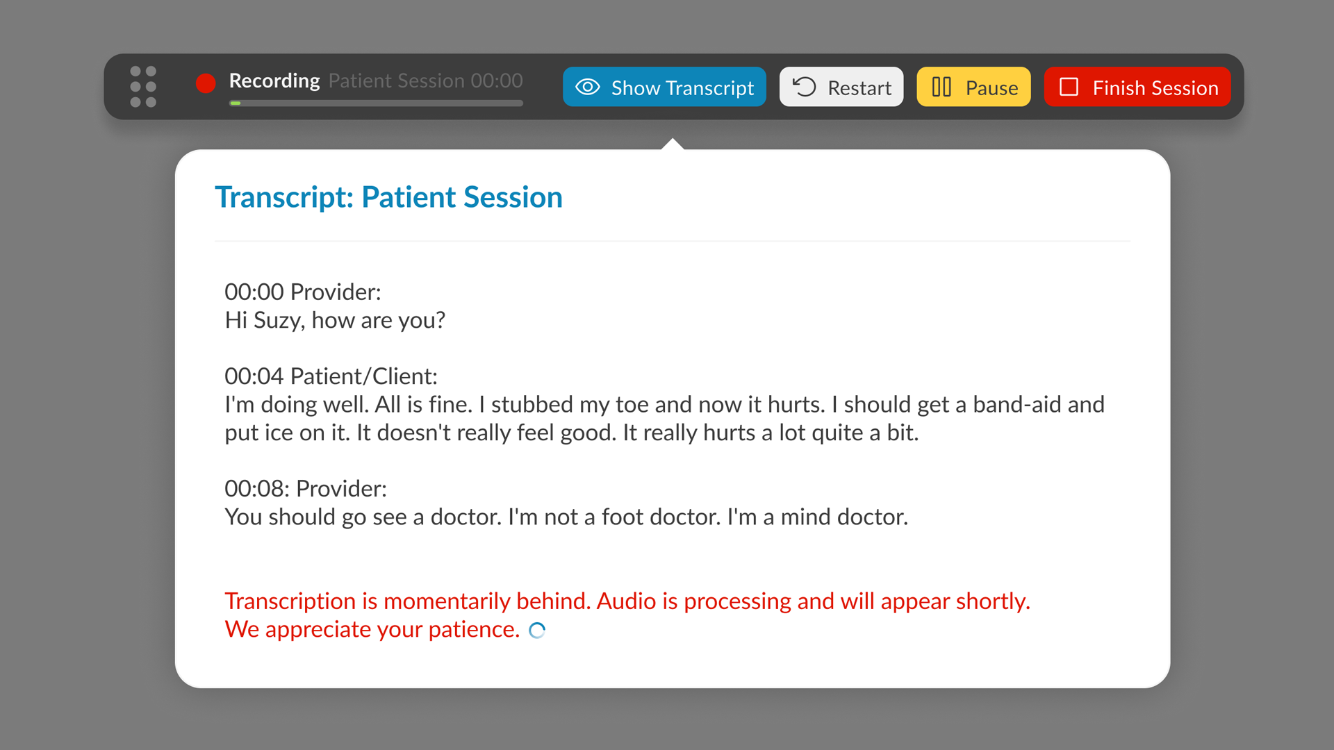
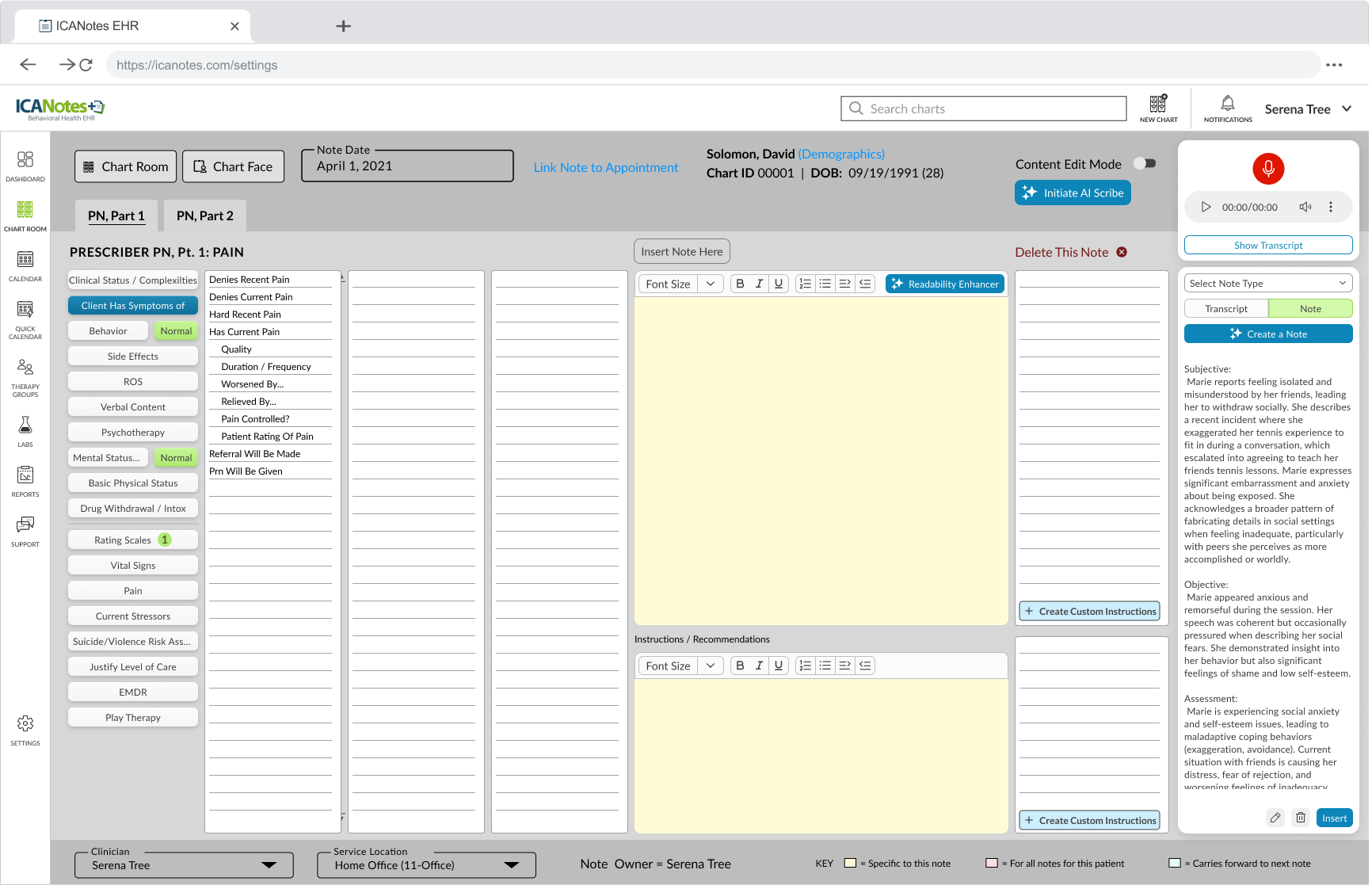
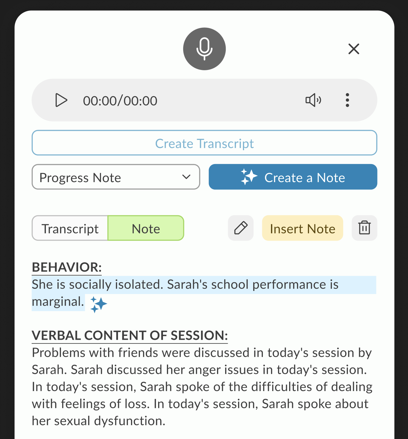
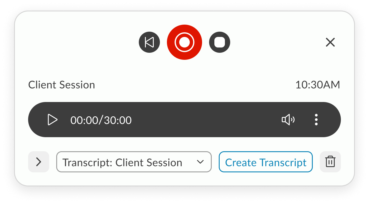
The final design brings transcription controls directly into the Notes screen, starting with session type selection (In-Person or Telehealth). Once live, the toolbar displays a popover with real-time transcription, pause/restart/stop controls, and a pulsating timer. In the redesigned UI, the toolbar is seamlessly integrated using the new design system, but remains draggable, allowing doctors to position it anywhere on the screen for convenience. The result is a flexible, unobtrusive workflow that supports both legacy and modern layouts without sacrificing usability.
Features
In-Person - Telehealth sessions
Record using built-in microphone
Local recording
Real time transcription
Pause, stop, restart
Add doctors remarks
Create Note
AI SCRIBE FEATURE RESEARCH
1. The Problem: The "Documentation Burden"
Research shows that for every hour a clinician spends with a patient, they spend nearly two hours on administrative tasks. In mental health, this is exacerbated by the need to capture nuanced behavioral observations.
Clinical Burnout
Administrative overload is the #1 driver of physician burnout.
The “Screen Barrier”
When a therapist looks at a screen to type, they miss micro-expressions and non-verbal cues (e.g., foot tapping, avoiding eye contact) essential for mental health assessments.
Memory Decay
If a note isn’t written immediately, “recalled” information is 15-20% less accurate.
2. User Needs Analysis
Based on your feature set, here are the core user needs that validate my design decisions:
Feature
Validating User Need
Speaker Designation
Mental health sessions often involve couples or family therapy; distinguishing between “Patient” and “Provider” is legally required for accurate medical records.
Draggable Toolbar
Clinicians use various EHR layouts; a fixed UI element might block critical historical patient data or suicide risk assessments.
Real-time Popover
Provides “Peace of Mind.” Doctors need to glance and ensure the AI is actually “hearing” the patient so they don’t lose an hour of data.
3. Technical Research & Edge Cases
Validating a feature requires showing you’ve thought about system resilience.
The Internet Lag Challenge
In Telehealth, “jitter” or packet loss is common.
Local Buffering
Validating the need for the browser to cache audio segments locally before syncing to the server.
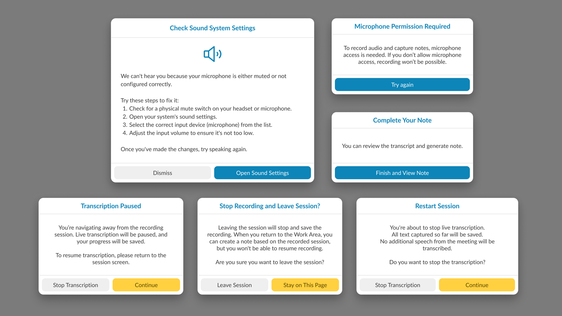
State Management
If the connection drops, the “Pulsating Timer” acts as a status indicator. Research suggests that Visual Feedback (the pulse) reduces user anxiety during technical glitches.
Privacy & Ethics (HIPAA)
In mental health, “Ambient Listening” raises privacy concerns.
Consent Workflow
Research indicates that patients feel more comfortable when they see a physical “Recording” indicator, which you’ve addressed with the live toolbar.
4. Competitive Benchmarking
Most AI scribes are third-party apps that require “copy-pasting” into an EHR. Our integration is validated by the “Single Source of Truth” principle:
Reduced Context Switching
Moving between apps causes a 40% drop in productivity. By putting controls directly in the Notes screen, you eliminate this cognitive load.
5. Metrics for Success (KPIs)
To validate the effectiveness of the AI Scribe, our research pointed out three primary KPIs that serve as benchmarks for success:
Time-to-Note Completion
We aimed for a 30-50% reduction in the time clinicians spend on post-session documentation, directly addressing the administrative burden.
Eye-Contact Ratio
Research also highlighted that clinician satisfaction is tied to patient engagement. We used qualitative feedback to track the increase in sustained eye contact and presence, moving away from “screen-focused” therapy.
Transcript Accuracy & Error Rate
We monitor the frequency of manual edits made to the AI-generated summaries to ensure the scribe consistently meets clinical standards with minimal intervention.
6. Final Reflection
Our research pointed out that in mental health, technology should be invisible. The success of the AI Scribe wasn’t just in the AI’s accuracy, but in the unobtrusive UI that allowed the human connection to remain the focal point of the session. By centering the design on the clinician’s need for presence and the patient’s need for privacy, we created a tool that felt like a partner rather than a distraction.
On-demand — slide-in when ready to capture the session.
Breaking and rebuilding until it works better.
Design Process
We mixed it up. I watched live sessions to see the real workflow in action — the pauses, the clicks, the workarounds. I used initial sketch, AI prototyping tools like Lovable to get ideas in front of people fast, then we brainstormed different approaches, called out dependencies, and left space for dealing with glitches.
After each iteration, I walked the idea through with the team, took notes on what actually landed, and folded those observations into the next round. We kept going until every stakeholder was on the same page and the flow felt solid enough to build.
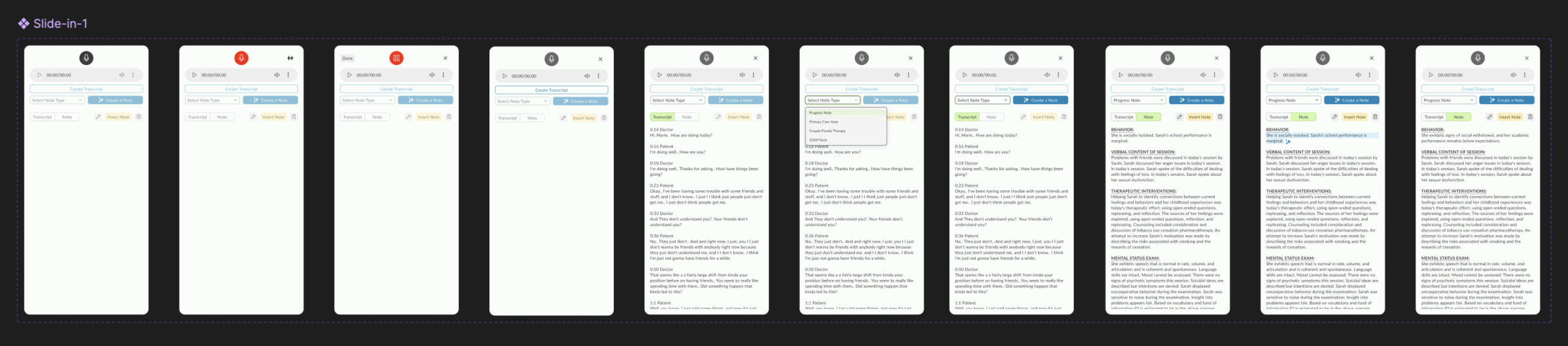
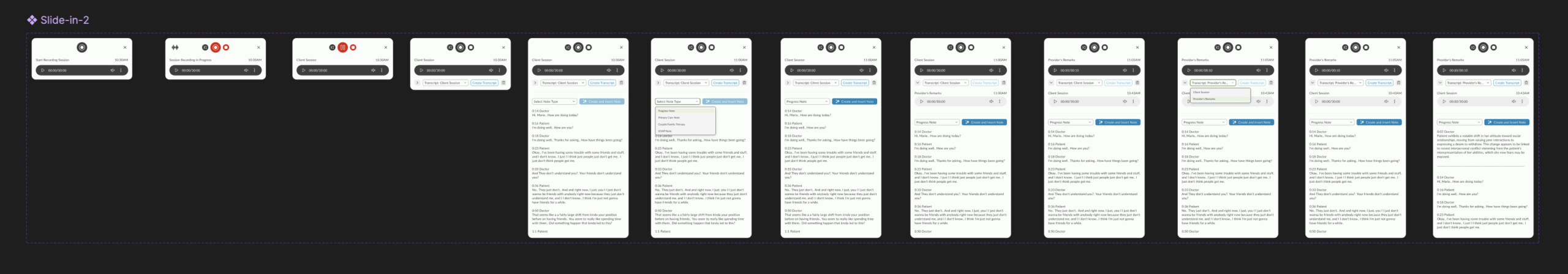
Exploration 1: Slide-in Modal from Note Screen
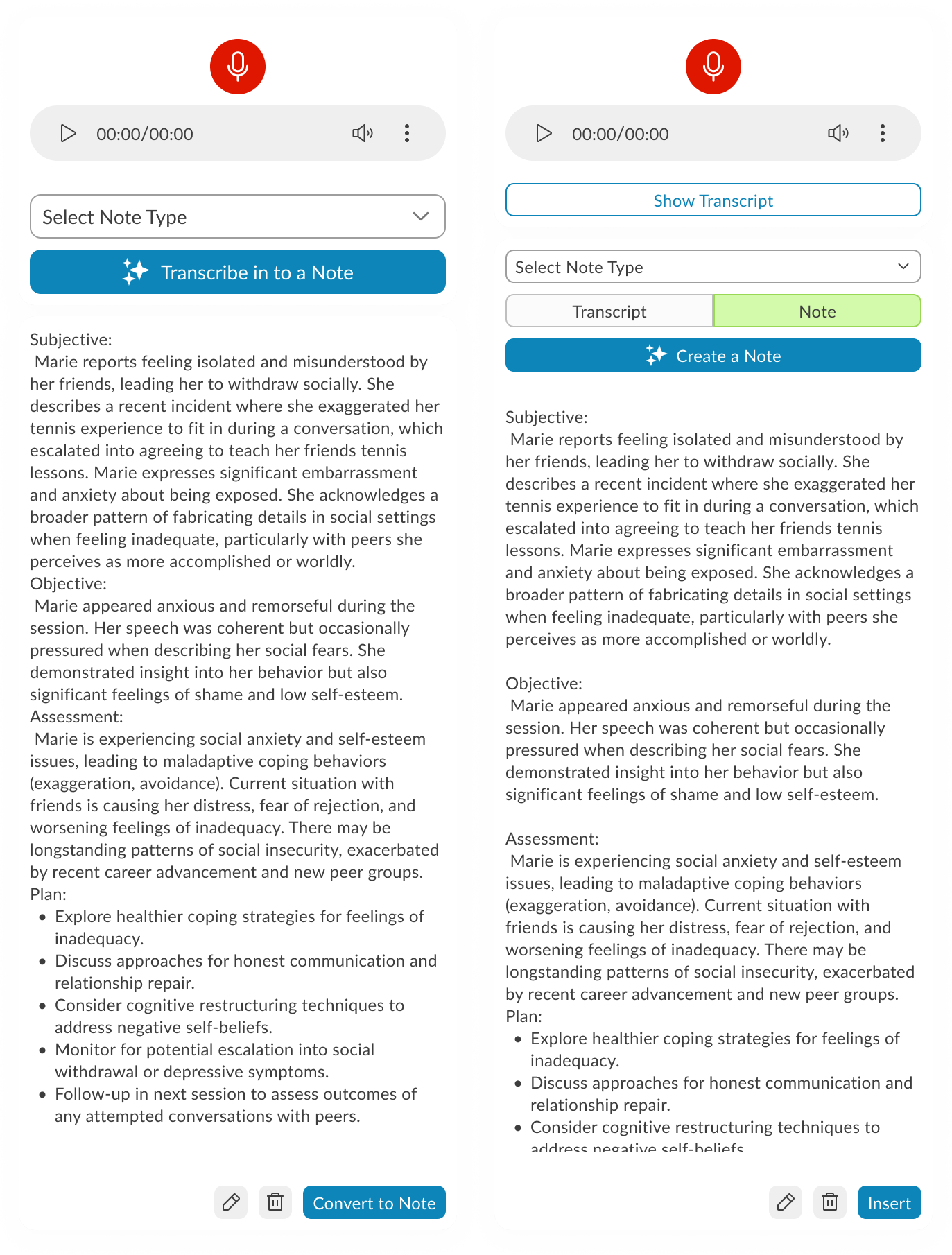
The AI Scribe interface launches as a slide-in modal over the existing Note screen. Recording controls sit at the top, followed by a note-type selector and a primary action button to transcribe or create a note. The generated transcript displays in a scrollable text area, pre-formatted into SOAP sections. Secondary actions for editing or inserting are placed inline at the bottom of the text area. The layout keeps the note content in focus while making recording and conversion accessible without leaving the screen.
On-demand — slide-in when ready to capture the session.
Breaking and rebuilding until it works better.
Exploration 2: Player-First Minimalism
A stripped-down starting point — just the essentials in view. Player controls take center stage, with the interface expanding only when transcription begins, keeping focus on the recording before the text takes over.
On-demand — slide-in when ready to capture the session.
Working session: Collaborative Refinement
With core components identified, this iteration shifted into a working session across design, engineering, AI, and PM teams. We tested how different layouts handled dependencies—especially across browsers—and moved components around based on live feedback. I experimented with using extra real estate to surface patient and doctor details in the slide-in, but later decided it was redundant since this data was already visible on the Note screen.
On-demand — slide-in when ready to capture the session.
Prototypes from the Working Session
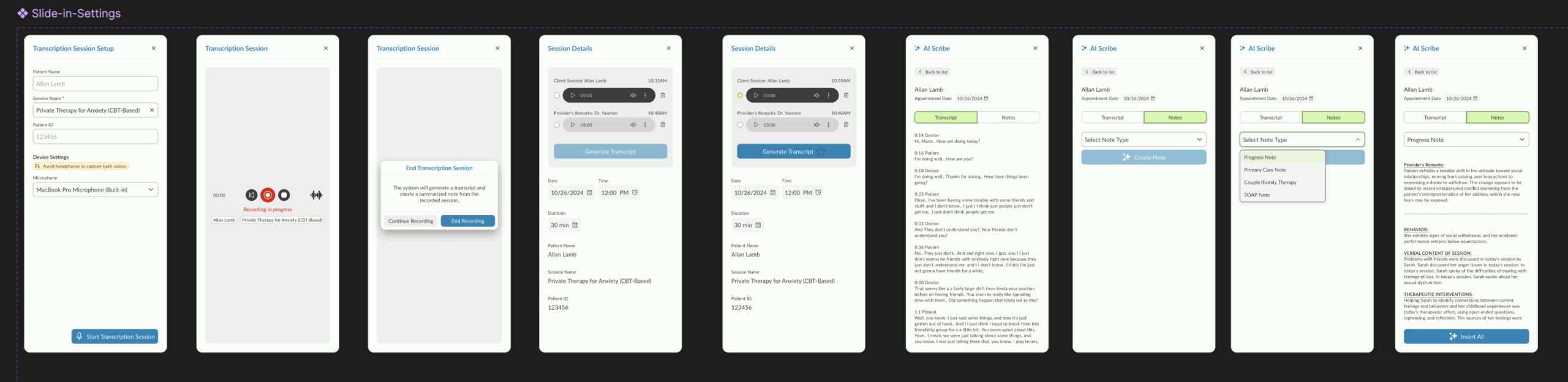
Prototype 1 – Guided Recording with Session Details This version walks the user through audio setup inside the product, displaying microphone and speaker options alongside session details. The recording starts via a blue CTA, followed by patient and doctor selection. As the session progresses, waveform visuals appear and the record button turns red. Doctors can pause after the patient leaves to add remarks, switch between transcript and note views, and use AI tools to generate a note. A note type dropdown determines how it’s inserted into the patient’s ongoing evaluation.
Prototype 2 – System-Level Setup with Section-Based Note Insertion Here, audio setup is integrated directly with system settings, so users can configure and test devices without hunting for them manually. Settings can be saved for future sessions, and test feedback is given visually with pop-ups. Recording remains live-only (no stored audio), relying on cache during internet drops. The post-session process allows granular control — instead of inserting an entire AI-generated note, users can insert individual sections into the patient’s record.
Prototype 3 – Telehealth Integration with Visible Recording Controls This iteration moves recording controls to the forefront, swaps the test button to red for visibility, and introduces telehealth support via native browser-based screen sharing with audio. Audio/video permissions are handled directly by the browser UI. For note creation, each transcript section now features a hover-based insert button centered in the component, streamlining the selective insertion process.
Transcription-Focused Refinement with Placement Constraints
This refinement zeroes in on audio transcription controls, starting with session type selection — In-Person (microphone only) or Telehealth (microphone + screen/audio share with native permission prompts). Once the session starts, a live transcript appears in a popover, with the ability to pause, restart (clearing all captured audio/transcript), or stop. A pulsating timer reinforces the recording state.
The catch: our Notes screen UI is old, overcrowded, and not designed to host a control-heavy toolbar. Two paths emerged:
Test a toolbar overlay on the existing UI to see how it behaves despite the space limitations.
Redesign the Notes screen using the new design system to free up space and make the toolbar feel integrated, with clean placement and modern styling.
The result is two prototypes: one working within the legacy constraints, and another envisioning how the feature could live in a refreshed UI.
User Testing Results (via Ballpark)
Our research pointed out that by using Ballpark’s prototype task tracking,
we could see exactly where clinicians hesitated during the session initiation flow.
Goal Success Rate: “Start Scribe Session”
Success Rate:94% (14/15 participants)
Avg. Time to Goal: 12 seconds
Synthesis:My research pointed out that the clear distinction between “In-Person” and “Telehealth” at the start of the flow reduced cognitive friction. The 6% failure rate was due to users looking for a “Settings” menu first, which led to a design iteration to move audio-input checks directly into the start button.
2. Path Analysis: Toolbar Customization
Common Path:Start Session → Move Toolbar → Resize Popover → Focus on Note
Observation:Our research highlighted that 85% of testers immediately dragged the toolbar to the top-right corner.
Synthesis: This validated the need for a draggable UI. Clinicians have a “muscle memory” for where their notes live; our design allowed them to keep that layout without interference.
3. Sentiment Analysis (Opinion Scale)
Question:“How confident did you feel that the AI was accurately capturing the session during periods of silence?”
Avg. Score:4.8 / 5.0
Synthesis:My research pointed out that the pulsating timer provided a necessary “system heartbeat.” Even during 30-second therapeutic silences, clinicians felt secure that the tool hadn’t disconnected.
4. Heatmap Insight: Transcript Popover
Finding: Ballpark clickmaps showed high engagement with the “Pause” button during sensitive patient moments (e.g., when a patient began to cry).
Synthesis:Our research pointed out that clinicians value agency over automation. Providing an easy-to-reach pause control on the draggable bar gave them the “ethical kill-switch” they needed to feel comfortable in a clinical setting.
The Ballpark Snapshot
“By analyzing the video responses and screen recordings in Ballpark, our research pointed out that the tool didn’t just capture data; it changed behavior. Clinicians stopped leaning into their screens and started leaning into their patients.”