In 2020, CVS Health decided to shift their attention away from a singular focus on the strength of the business (pharmacy) to one that would holistically encompass all of its parts and, in doing so, highlight recent acquisitions and emphasize the growing expertise of their health solutions portfolio. As a component to this, they would need to introduce a reimagined solution for enterprise level design system that could scale to serve those needs while ensuring high levels of usability, and WCAG 2.1 AAA levels of accessibility.
Build design system’s components, patterns, and style guidelines
Document principles, offered as code to increase efficiency, enable re-usability at scale, and helps maintain consistency between design and code.
Optimize menus, navigation, feature discoverability, and clear call-to-actions.
Ensure a seamless experience for web, iOS and Android users.
Design a visually appealing UI that is engaging without causing cognitive overload.
CVS’s overall e-commerce UX performance is mediocre. It is especially issues related to broken Homepage & Category, poor Site-Wide Features, Inconsistency leads to higher levels of cognitive load and poor On-Site Search that detract from CVS’s UX performance.
There were two main challenges for this project. The first was to create a strategy that would ensure the functionality that would significantly impact the overall business.
Build component library for enterprise level design system (iOS, Android, Web).
Ensure compliance with WCAG 2.1 AA/AAA standards.
Work closely with developers to break down the process and gather feedback.
Integrate motion design.
3 months
WIP
Review
Development
Shipped ✅
Archive
Component library release Mar 2020
Web
Button
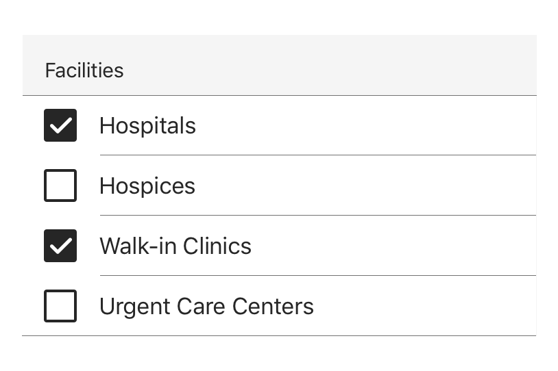
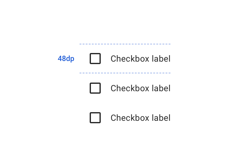
Checkbox
Icon
Input
Link
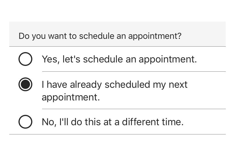
Radio Button
Select
Text Input
Text Area
Typography
iOS
Button
Checkbox
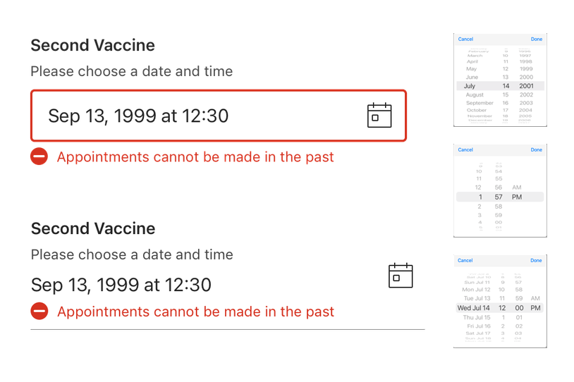
Date Picker
Divider
Radio Button
Select
Switch
Text Field
Android
Alert Box
Button
Checkbox
Date Picker
Exposed Drop Down
Progress Indicator
Radio Button
Snackbar
Text Field
Time Picker
My design process
Once I have the workflows through discovery, research, and testing, I generally start “designing” what a proof of concept or final product will actually look and feel like. Color, typography, shapes, and motion are all part of my toolbox, but they mean nothing without the infrastructure of understanding.
Auditing products
Component research
API decision
Internal discussion
Advocates review session
Creating the base variant
Creating the variants in different themes
Documentation
Motion design
Dev review
Design review
Time to go live
UX process
We had a hypothesis that efficiencies and speed could be built in the way current product operates.
Next, we took a holistic look at the sticker sheet of design patterns and those patterns. The purpose of this was to have reusable parts that support the brand visually, the users’ experience, product’s function, and designers’/engineers’ efficiency for all platforms.
UX writes most of the tickets (documented visual, logic, and functionality that engineering builds into the product). Our product teams work in an AGILE environment.
Button
A common action that can be easily performed with one click or tap.
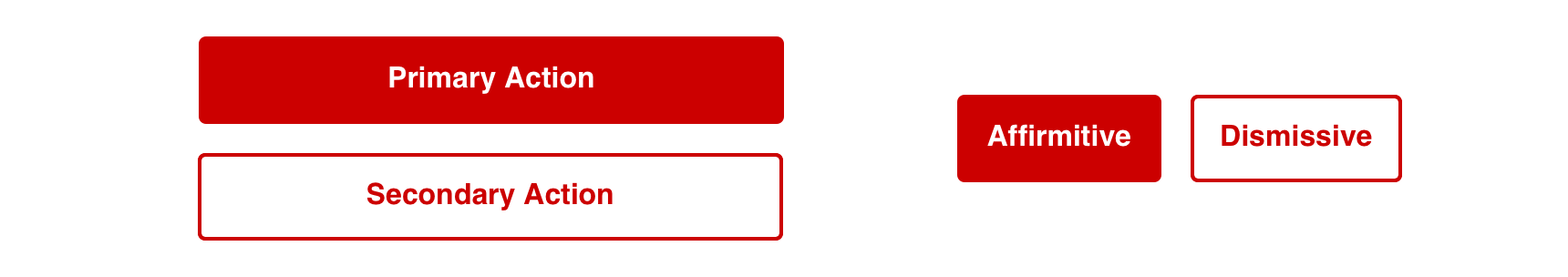
For button groups that have multiple priorities, use Primary along with Default or Tertiary Buttons pending on emphasis. These buttons usually perform complimentary actions.
Similar Priorities
For actions that have similar priorities, group either Secondary Buttons or Tertiary Buttons together
For button groups that have multiple priorities, use Primary along with Default or Tertiary Buttons pending on emphasis. These buttons usually perform complimentary actions.
Visual Style
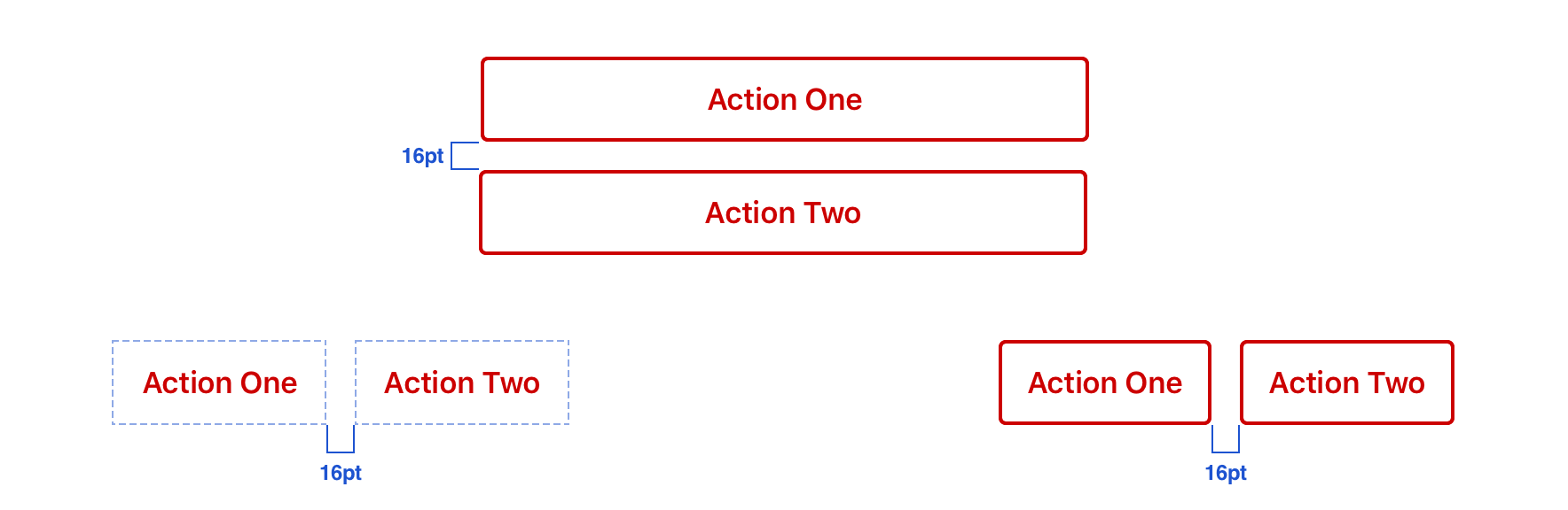
Buttons should have a minimum 16px margins between other objects in horizontal layouts, as well as, 16px above and below in relation to other content
For button groups that have multiple priorities, use Primary along with Default or Tertiary Buttons pending on emphasis. These buttons usually perform complimentary actions.
Icons
Icons can be added adjacent to the label as a decorative element that is relative to the action or purpose of the button.
For button groups that have multiple priorities, use Primary along with Default or Tertiary Buttons pending on emphasis. These buttons usually perform complimentary actions.
Don't
Avoid grouping Primary buttons together
Avoid stacked buttons on responsive pages for directional navigation
Avoid long labels
Avoid using only an icon to communicate a button’s purpose or action
Usage
Buttons represent actions, such as submitting data, launching elements, toggling visibility, etc. If navigating to a different site or page, a link should be used.
Overview
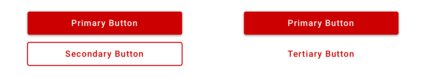
Primary Button: Used to call attention to the main action of the page or large section. Though it should generally be used only once per page, Primary Buttons can be used multiple times if representing parallel primary actions, such as “Add to Cart.”
Secondary Button: Used for general actions on a page or in a section
Tertiary Button: Used for subtle actions on a page or in a section that are not a priority
Content Strategy
Use Title Case
Lead with a verb
Aim for short actions, around 1-4 words
Use simple global commands when possible: Save, Back, Next, Apply, etc.
Add specificity with purpose (e.g. “Assign as Primary Care Physician” brings necessary meaning to the action, compared to the shorter “Assign”)
For parallel-use button such as “Add to cart” there should be aria-label or aria-labelledby which allows assistive technology to distinguish between other buttons with the same name. The visible label should start, for example: “Add to cart <name of product>”
For buttons that require more context which read individually, use aria-describedby to give assistive technology more information about what the button relates and its possible actions.
Accessibility
Characteristics
Performs actions such as submitting a form, opening a dialog, cancelling an action, or performing a command such as inserting a new record or displaying information
Operates with “Enter” key and “Spacebar” key
Button Labels will default to centered alignment when single line, and will display left aligned when wrapped for improved legibility.
Focus Expectations
Focus stays on button until action is performed
Following button activation, focus is set depending on the type of action the button performs
Screen Reader Expectations
This is a general experience expectation, but there are variations in how assistive technology responds on certain browsers and screen readers.
“{Button Label}, button”
Disabled state: “{Button Label}, dimmed, button”
Icons don’t need alt text since they are decorative and accompany a label
Button
Primary actions should generally be presented first within a group of buttons.
Most directional patterns on iOS utilize the navigation bar where “Back” is in the top left and “Next” is in the top right. However, a Primary Button can also be used when needing to call attention to directional actions.
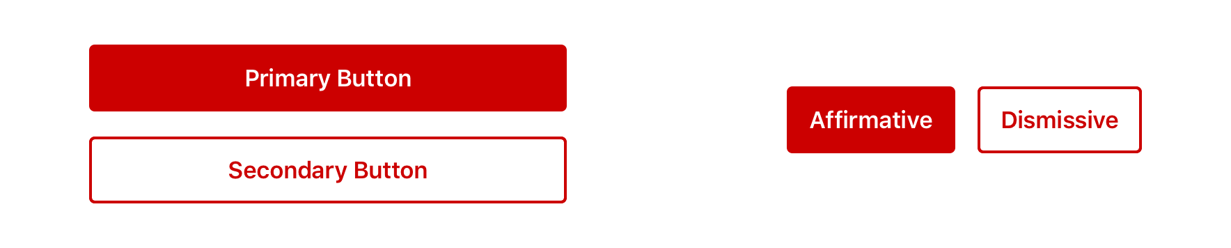
Similar Priorities
For actions that have similar priorities, group either Default Buttons or Tertiary Buttons together
Visual Style
Buttons should have a minimum of 16pt margin above and below in relation to other content
Icons
Icons can be added adjacent to the label as a decorative element that is relative to the action or purpose of the button.
Icons can be leading or trailing relative to the label
Don't
Avoid grouping Primary buttons together
Avoid stacked buttons on responsive pages for directional navigation
Avoid long labels
Avoid using only an icon to communicate a button’s purpose or action
Usage
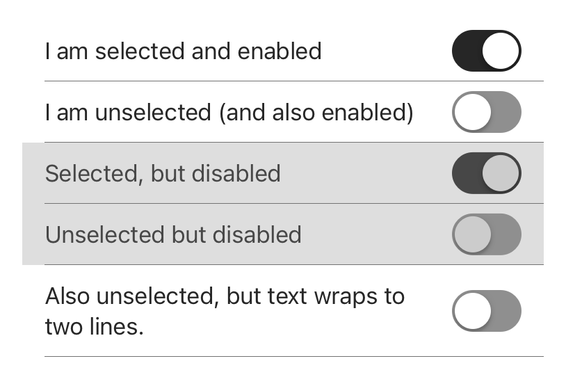
Switches provide two mutually exclusive choices.
For iOS mobile devices, always use in a UITableViewCell.
Switches are designed for immediate user settings changes.
All switches have a visible label that clearly conveys what option will turn on.
Additional Notes:
If immediate API communication and input validation is required, prefer use of Forms and Submit buttons (i.e: Radio buttons, Checkboxes, etc.). Form components are built for error handling where Switches are not. Prefer not using Switches in forms with submit buttons.
If Switch is preferred and need to communicate to backend service, use of Switches is appropriate only if programmed optimistically.
Use Switches in table rows. If an “on/off” state control is desired in other containers (navigation or toolbars) prefer a button or icons.
Content Strategy
Because Switch is inherently an on/off toggle, actions are not required to highlight that behavior.
Instead, keep labels concise by focusing on the thing itself that’s getting switched on or off — adding actions only when they’re essential to the switch’s meaning (e.g. Offload Unused Apps).
Aetna: Use Title Case
Exceptions include longer sentence-like labels
CVS: Use Sentence case
Accessibility
Characteristics
Performs actions such as submitting a form, opening a dialog, cancelling an action, or performing a command such as inserting a new record or displaying information
Button Labels will default to centered alignment when single line, and will display left aligned when wrapped for improved legibility
Focus expectations
Focus stays on button until action is performed
Following button activation, focus is set depending on the type of action the button performs
Screen reader expectations
“{Button Label}, button”
Disabled state: “{Button Label}, dimmed, button”
Icons don’t receive focus since they are decorative
Button
A common action that can be easily performed with one click or tap.
For button groups that have multiple priorities, use Primary along with Secondary or Tertiary Buttons pending on emphasis. These buttons usually perform complimentary actions.
Similar Priorities
For actions that have similar priorities, group either Secondary Buttons or Tertiary Buttons together
For actions that have similar priorities, group either Default Buttons or Tertiary Buttons together
Visual Style
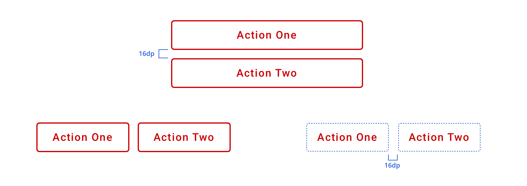
Buttons should have a minimum 16px margins between other objects in horizontal layouts, as well as, 16px above and below in relation to other content
Buttons should have a minimum of 16dp margin above and below in relation to other content
Icons
Icons can be added adjacent to the label as a decorative element that is relative to the action or purpose of the button.
Icons can be leading or trailing relative to the label
Don't
Avoid grouping Primary buttons together
Avoid long labels
Avoid using only an icon to communicate a button’s purpose or action
Usage
Buttons represent actions, such as submitting data, launching elements, toggling visibility, etc. If navigating to a different site or page, a link should be used.
Overview
Primary Button: Used to call attention to the main action of the page or large section. Though it should generally be used only once per page, Primary Buttons can be used multiple times if representing parallel primary actions, such as “Add to Cart.”
Secondary Button: Used for general actions on a page or in a section
Tertiary Button: Used for subtle actions on a page or in a section that are not a priority
Content Strategy
Use Title Case
Lead with a verb
Aim for short actions, around 1-4 words
Use simple global commands when possible: Save, Back, Next, Apply, etc.
Add specificity with purpose (e.g. “Assign as Primary Care Physician” brings necessary meaning to the action, compared to the shorter “Assign”)
Accessibility Delegate added when action label doesn’t provide enough context. (Example: {Button label}, “Confirm Quantity”, “tap to activate”, but if an AccessibilityDelegate is added, the button will read {Button label}, “Confirm Quantity”, “double tap to confirm amount and review order”)
Accessibility
Characteristics
Performs actions such as submitting a form, opening a dialog, cancelling an action, or performing a command such as inserting a new record or displaying information
Operates with “Enter” key and “Spacebar” key if user is navigating with a keyboard
Focus Expectations
Focus stays on button until action is performed
Following button activation, focus is set depending on the type of action the button performs
Screen Reader Expectations
Operating system might announce different variations depending on the manufacturer and software versions.
“{Button Label}, button and/or {operating system hint}”


