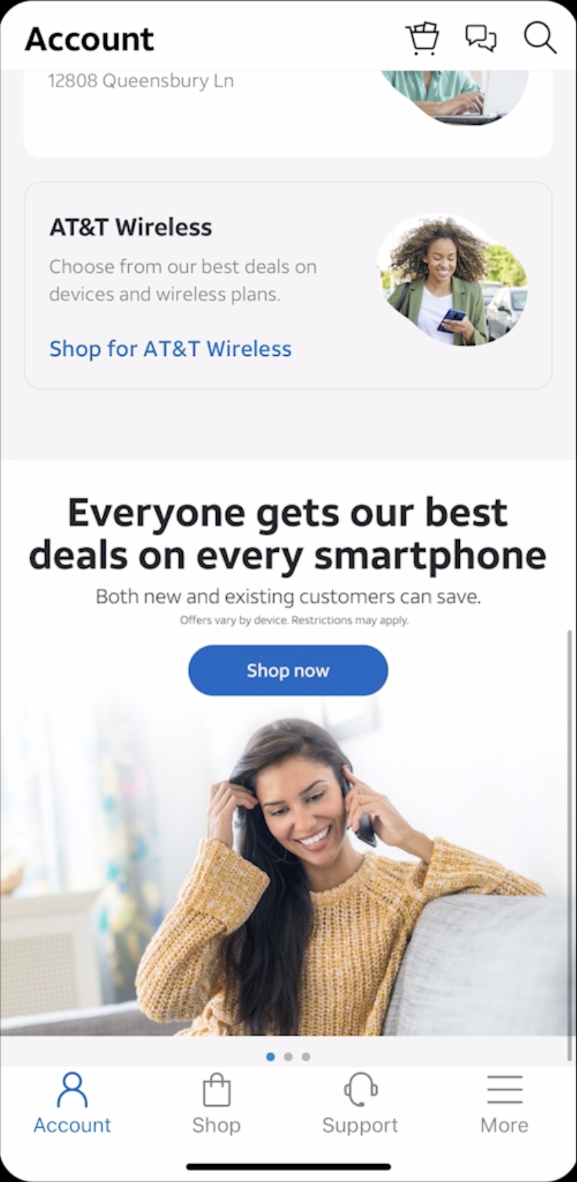
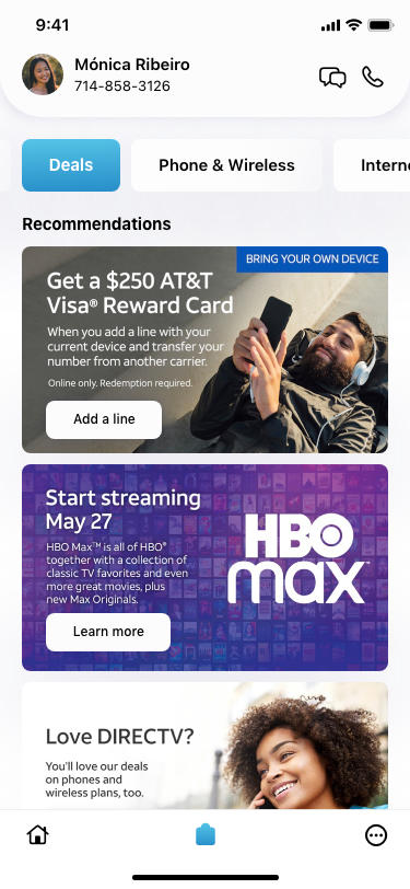
Upgrade your phone or plan for in-store pickup or delivery
Get support via live chat with an agent or find quick solutions with helpful articles
Ideal Users for myAT&T:
Potential customers considering switching to AT&T
Existing AT&T customers
Tech-savvy individuals who prefer managing their accounts digitally
Users who want to avoid customer service calls or visiting physical stores
Explore the look and feel within brand guidelines and the new design system.
Utilize UXR insights from previous testing.
Ensure compliance with WCAG 2.2 AA standards.
Regularly collaborate with the accessibility (a11y) team.
Work closely with developers to break down the process and gather feedback.
Finalize flows for each use case.
Integrate motion design into the interface.
Home screen lacks essential information such as data usage, bill payment options, and new offers.
Design system needs updating to align with the new AT&T guidelines.
Non-compliance with WCAG 2.2 AA standards, including color contrast, keyboard navigation, screen reader support, human-computer interaction (HCI), closed captions, audio descriptors, reflow, and motion design.
Content and CTA prioritization are disorganized in the information architecture.
Inconsistent brand colors, layouts, and visuals.
Missing chatbot functionality and handling of edge cases.
Update comps with the newly designed AT&T enterprise design system.
Adopt AT&T design guidelines for a visually coherent interface.
Optimize menus, navigation, feature discoverability, and clear call-to-actions.
Integrate the new chatbot, Alice.
Add relevant information and personalized user experiences.
Incorporate Geofence (ADTM feature) to inform users of available hotspots.
Ensure a seamless experience for both iOS and Android users.
Create intuitive user flows to improve task completion times.
Design a visually appealing interface that is engaging without causing cognitive overload.
Implement a user-centered approach with a focus on mobile-first design principles.
Ensure the overall feel encourages regular check-ins and profile completion.
3 months
WIP
Review
Development
Shipped ✅
Archive
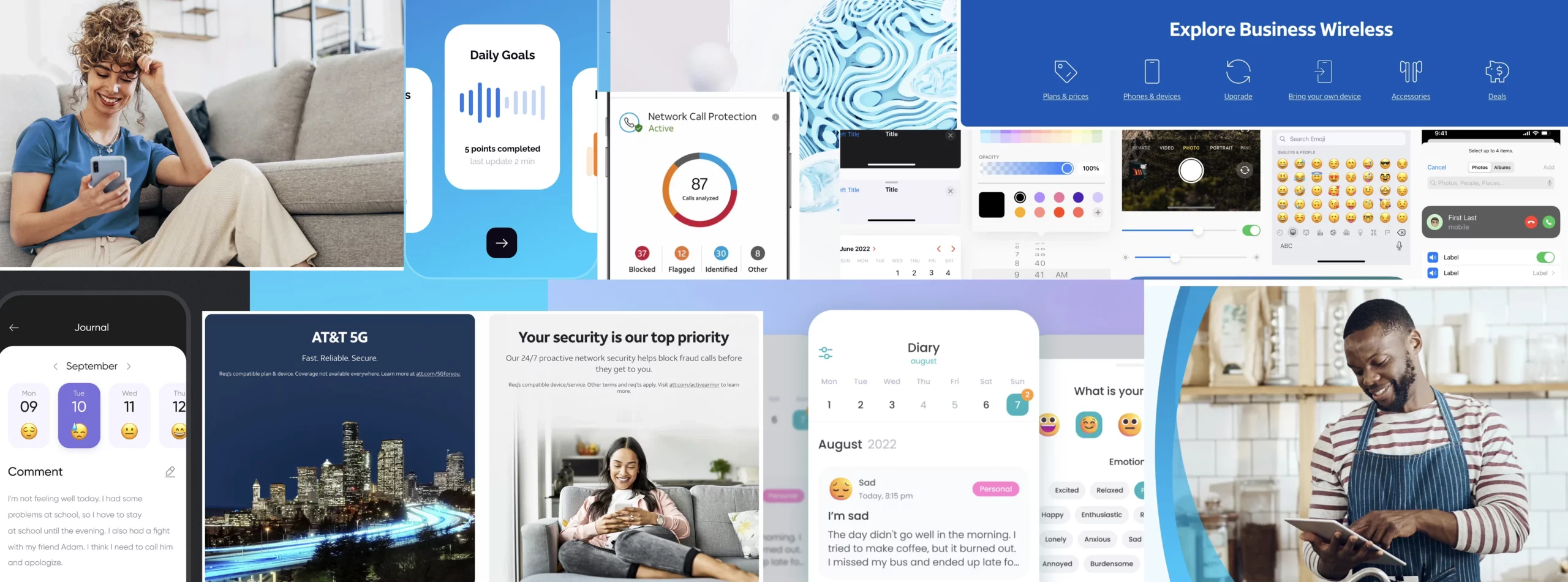
Final product shots
Product features
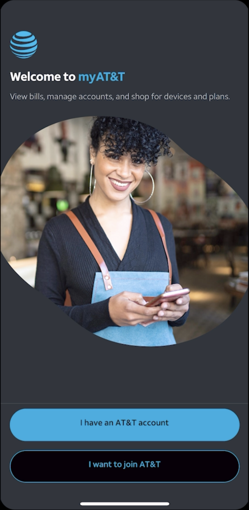
Sign in / Sign out / Create account
User profile (Product Registration)
Search
Chatbot
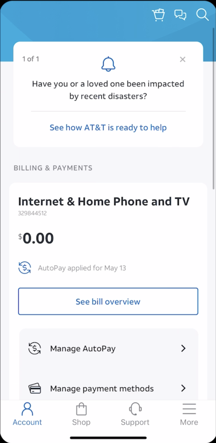
Pay bill
Set autopay
Geofencing
Manage payment
Payment history
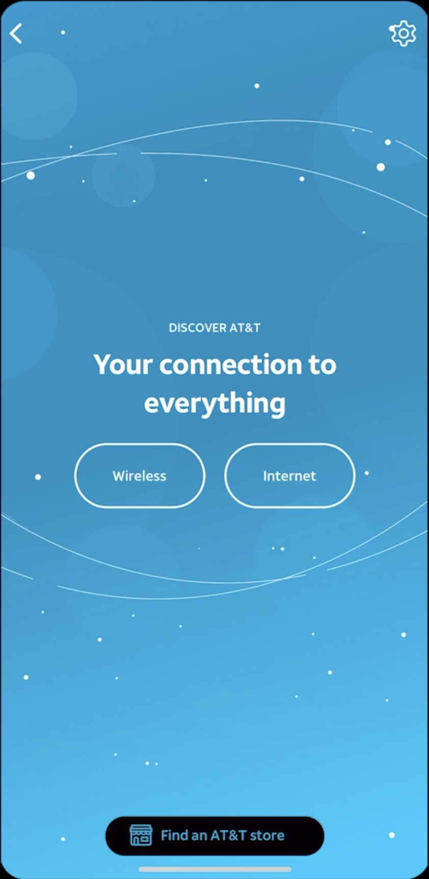
Link to online store
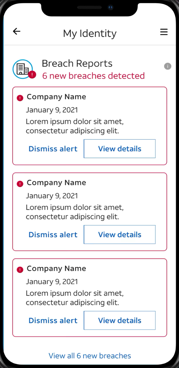
Active armor
Notificaitons
Case Study
I began with competitive research and mapped UX flows into reusable patterns and components in Figma. Applying user-centered design principles, I created a clean, accessible interface with motion design for feedback. Designs were tested with users, iterated with stakeholders, and refined through sprints to deliver an intuitive, scalable solution.
Setting mood board
Ideal Users for myAT&T
Prospective customers exploring AT&T before switching.
Current AT&T subscribers managing services and billing.
Digital-first, tech-savvy users who prefer self-service over calls.
Customers seeking convenience and wanting to avoid store visits or long support wait times.
Grid / Hotspot / Criterion
8pt 12col Grid
Lesson flow
Utilizing enterprise level design system
I applied AT&T brand guidelines and enterprise level design system to create an inviting and user-friendly interface, ensuring compliance with AA and AAA accessibility standards for maximum inclusivity and readability.
Previous design
Release notes
What’s New
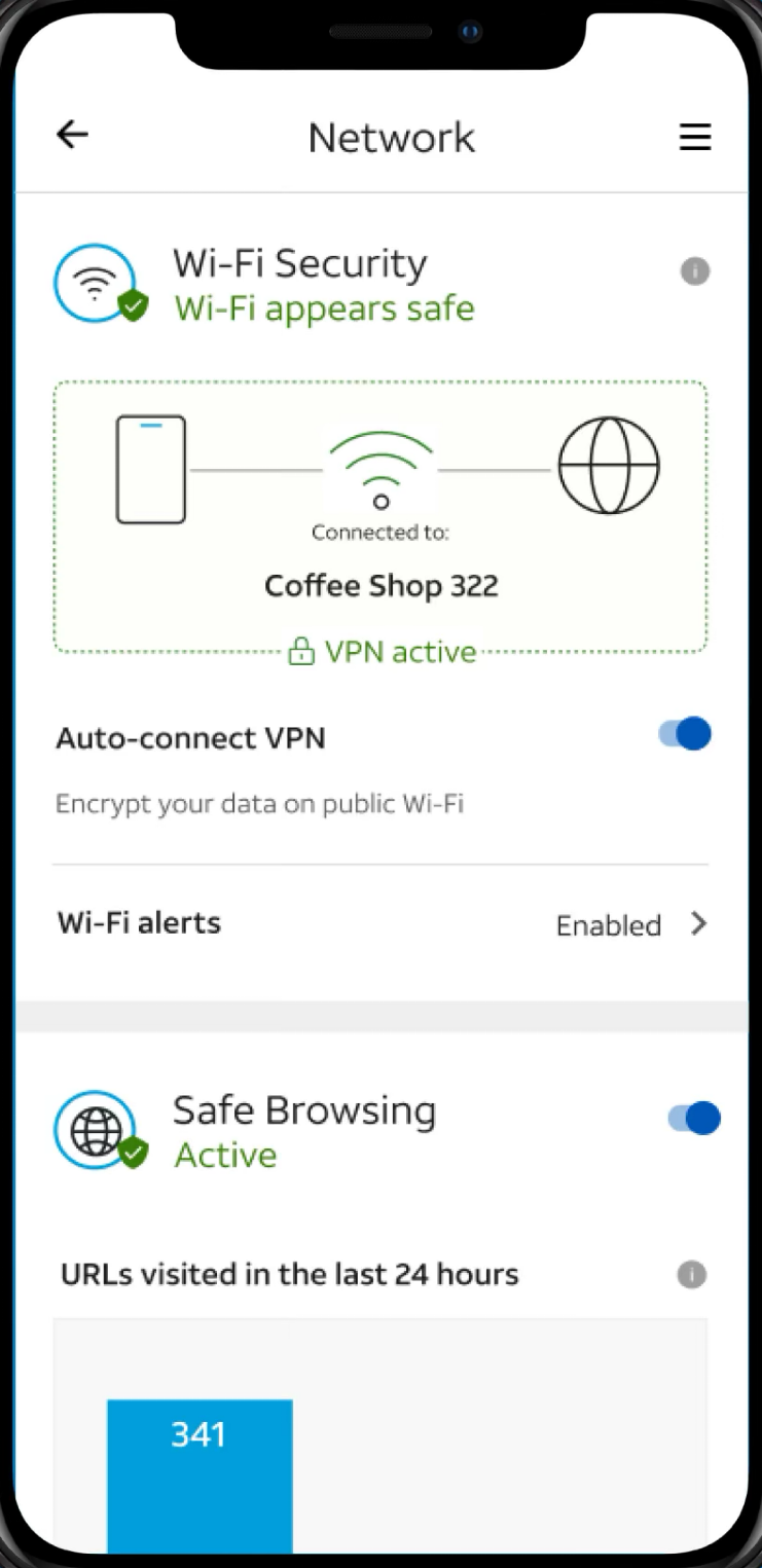
Enhanced security controls: Block spam and fraud calls, and manage AT&T ActiveArmor℠ features directly from the in-app security dashboard.
Better network tools: Test internet speed, check your router gateway, and troubleshoot issues — all within the app.
Additional Updates
Smoother wireless upgrade experience.
General performance improvements and bug fixes.
Optimized
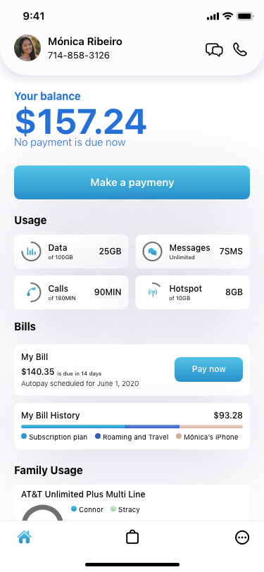
• Check data usage from home screen. • One touch View/pay bill • Upgrade your phone or plan and make changes from home screen.
Optimized
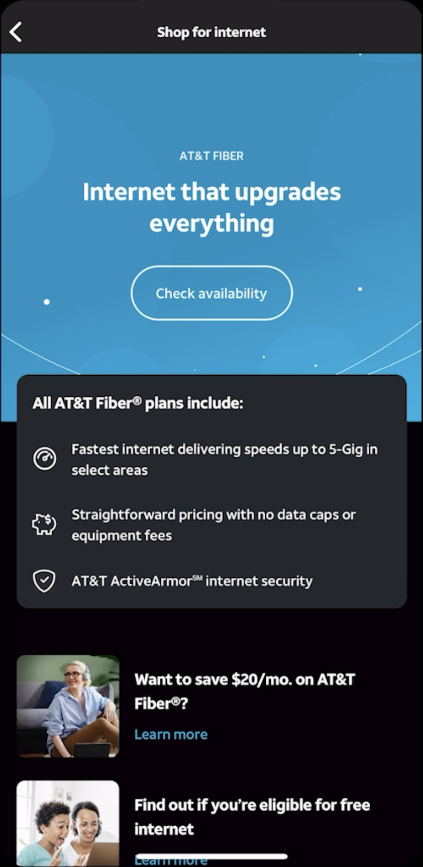
A simplified shop experience
The shop experience in the myAT&T app had not been updated for years and aside from starting to look outdated, was somewhat challenging for users to navigate. Working with UX designer, we created a simpler and easier-to-navigate experience that more closely aligned to business strategies.
Optimized
New look & feel with 2022 updated illustrations, icons and design system
Optimized
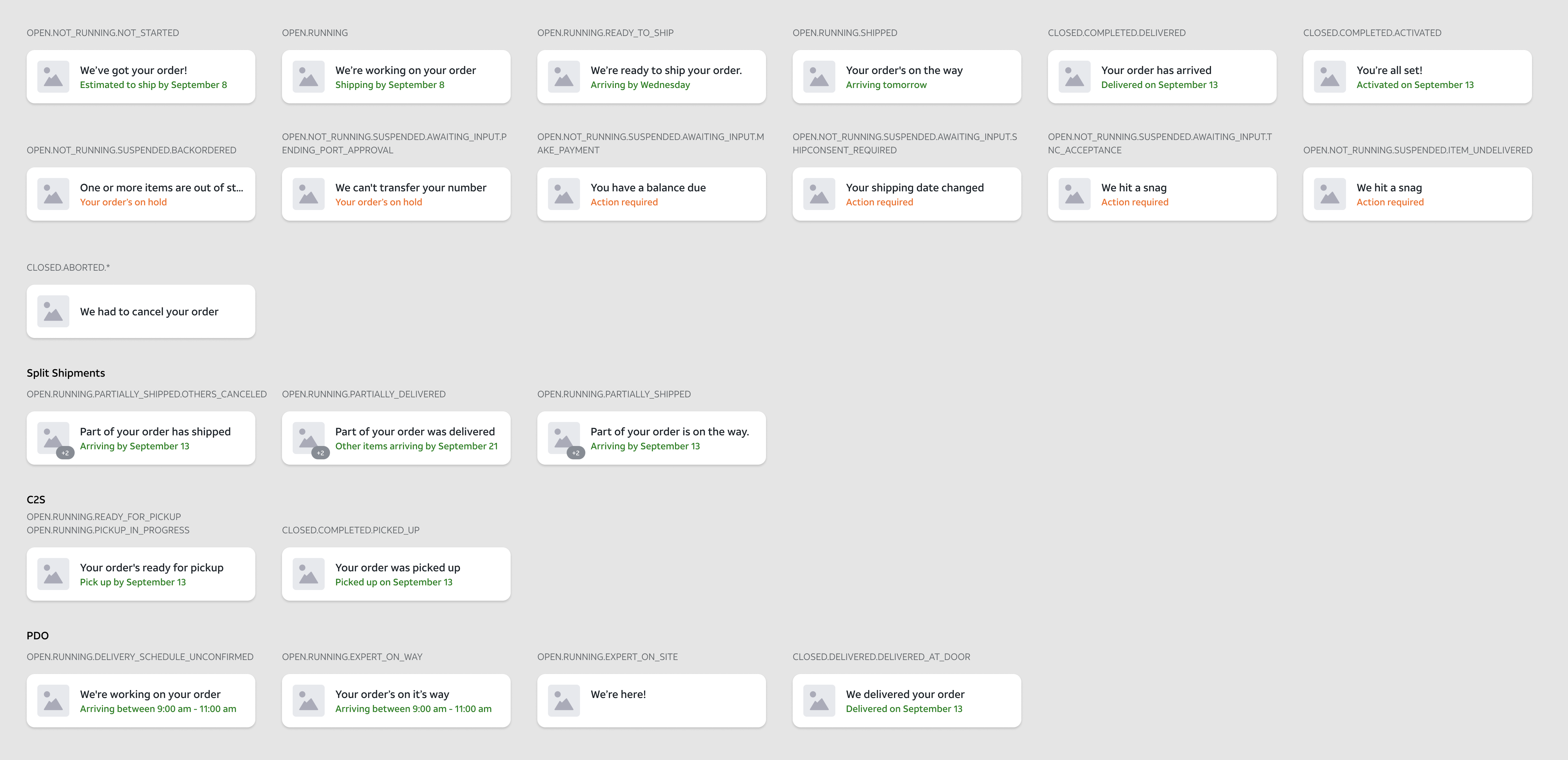
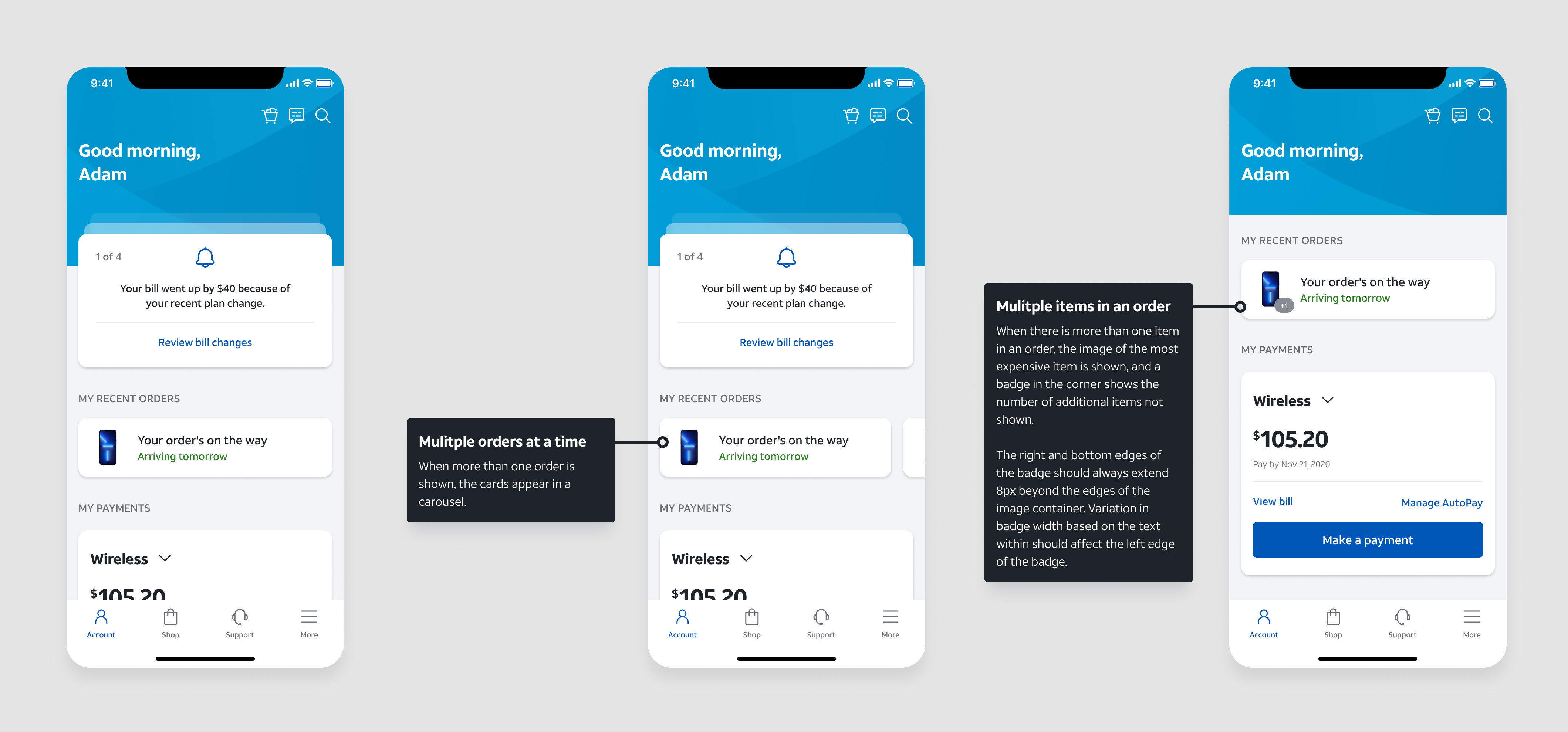
New order cards that deliver
The myAT&T app’s post-order experience was a pain point for both customers and the business, causing millions of calls to customer care. The updated simple and straightforward experience got three times the engagement from customers and cut calls in half.
Problem
The existing order card was hard to find, as it was far down the cluttered homepage.
The existing card also didn’t give customers information about the order status, forcing them to click through to a web page to get any information.
Previous cards
Release Notes
Managing your AT&T account is now simpler than ever with the myAT&T app:
Check data usage: Quickly track your wireless and Internet usage right from the overview screen.
Pay your bill: View and pay in a few taps. Set up how and when you’d like to pay, and we’ll remind you when your bill is ready.
Upgrade anytime: Easily upgrade your phone or plan — pick it up in-store or have it delivered to your door.